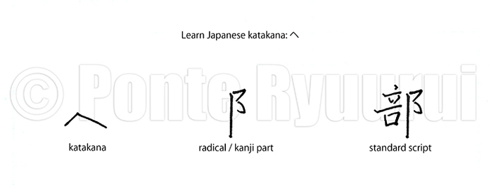
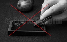
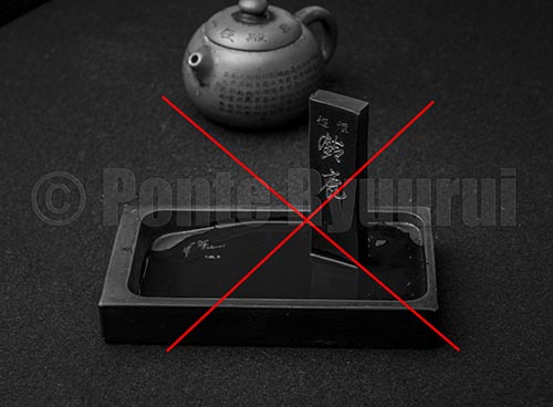
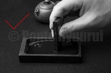
 Japanese katakana syllabogram ヘ is derived from the standard script (楷書) form of the Japanese kanji 部 (section, department). If you look at the diagram above, you will notice that the shape of katakana ヘ follows the shape of the upper part of the radical 阝(right village radical). The stroke order of both is the same. and follows the same stroke order. The shape of the Japanese katakana syllabogram ヘ is virtually identical to the shape of hiragana syllabogram へ. Both syllabograms are also based on the same Japanese kanji 部. 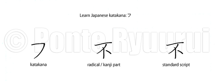 Japanese katakana syllabogram フ is derived from the standard script (楷書) form of the Japanese kanji 不 (negative, un-, non-). If you look at the diagram above, you will notice that katakana フ follows the shape of the top part of the character 不 (first two strokes), and has the same stroke order. Although the shape of katakana syllabogram フ is different from the shape of hiragana syllabogram ふ, both syllabograms are based on the same Japanese kanji 不. 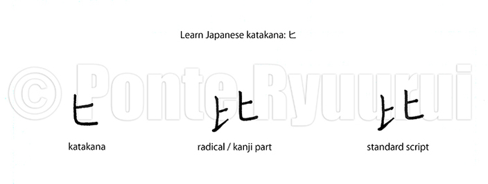 Japanese katakana syllabogram ヒ is derived from the standard script (楷書) form of the Japanese kanji 比 (compare). If you look at the diagram above, you will notice that the shape of katakana ヒ is identical to the right-hand side of the character 比, and follows the same stroke order Although the shape of katakana syllabogram ヒ is different from the shape of hiragana syllabogram ひ, both syllabograms are based on the same Japanese kanji 比. 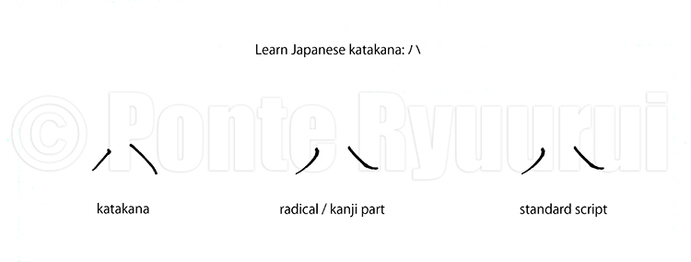 Japanese katakana syllabogram ハ is derived from the standard script (楷書) form of the Japanese kanji 八 (eight). If you look at the diagram above, you will notice that the shape of katakana ハ is identical to the one of kanji 八, and has the same stroke order. 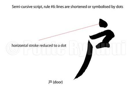 To learn about other rules of writing in semi-cursive script (行書), follow this link. This rule corresponds with the rule #6 of writing Chinese calligraphy in cursive script (草書). The concept is very similar, and the aim is to reduce the characters structure and make it more compact. Also, it speeds up writing, which is one of main purposes of semi-cursive and cursive scripts. In case of the character 戸 (door), except the top horizontal line, which was reduced to a dot, the character structure could be classified as a relaxed standard script (楷書). The differences between the regular script and semi-cursive can vary from be subtle to drastic. Sometimes, it may be difficult to classify a single character, especially that there are many various types of standard and semi-cursive scripts. Semi-cursive script will offer fewer opportunities for reducing lines to dots, in comparison with cursive script (草書). 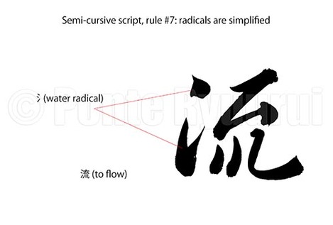 To view other rules of writing Chinese calligraphy in semi-cursive script (行書), click here. Similarly to the rule #7 of writing calligraphy in cursive script (草書), the radical can be simplified in semi-cursive script. The difference is, that the simplification is not as significant as incursive script. There is a delicate border between the semi-cursive script and standard script (楷書) on one side, and cursive script on the other. Cross-over scripts are known as standard-semi-cursive (楷行書), and cursive-semi-cursive (行草書). Depending on the degree of simplification or formal appearance of strokes, semi-cursive script can resemble either of the scripts that it serves as a bridge for. In the above diagram you can see the water radical (氵) written in two brush strokes, and not three as in standard script. The same form can be used in cursive script, though the top dot is usually connected with the bottom part of 氵 by the unbroken line (連綿). 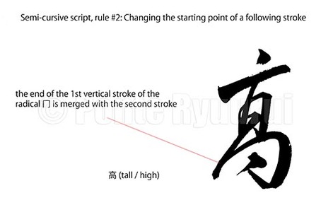 To read more on other rules of writing in semi-cursive script (行書), please see the the full list. Merging two or more strokes into one brush stroke usually alters the appearance of given character. The trick of Chinese calligraphy is to change the structure of a character, without distorting the balance. Radical changes, such as altering of the starting point of a given stroke, will distort the shape of a given kanji radical. In the the above diagram, the character 高, or more precisely 髙, which is a kanji variant (異体字) of 高, has the 冂 (upside-down box radical) disformed by a change in the starting point of a second stroke of that radical. The steep slanting vertical line in the "squashed" radical 冂, corresponds with the top thick vertical line, forming a visual enclosure for the middle part of the character. The kanji seems distorted, but it is balanced. That is a beauty and magic of semi-cursive and cursive (草書) scripts. The entire structure of 髙 is "fastened" with the unbriken line (連綿) technique, which adds additional drama and movement. 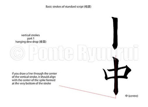 To read more on other types of strokes in standard script (楷書), please click here. Vertical strokes of standard script are among the most difficult brush strokes in Chinese calligraphy. They are complex (many micro brush movements) and require a lot of practice. The differences between the vertical strokes of Chinese calligraphy can be brought down to stroke endings. The foundation on which each of those strokes is built, is known as the "iron pole" (鉄柱), and it is one of the 8 core strokes of standard script (永字八法). The name "hanging dew drop" (垂露) comes from the appearance of the ending of this type of vertical stroke. It resembles a drop of dew hanging at the very end of a branch, or a twig. Chinese calligraphy and its theories are heavily related to nature. Many Chinese calligraphers based their calligraphy styles (書風) on natural phenomena. A falling rock, moves of a female sword dancer, geese turning their heads, etc. The difficulty of writing a hanging dew drop stroke, is in the challenge of presenting the kinetic energy of the water droplet, that is growing on the tip of a small branch. The video (below) shows only one style of writing the hanging dew drop stroke, which evolved during the Tang dynasty (唐朝, 618 - 907), and it is often found in the masterpieces of Ouyang Xun (歐陽詢, 557 – 641) . 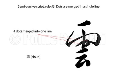 To read more on other rules of writing in semi-cursive script (行書), please see the the full list. Similarly to the third rule of writing Chinese calligraphy in cursive script, in semi-cursive script dots can be merged into a single line, too. Often times dots are connected in a way that even though they are written with a single brush stroke, one can still distinguish how many dots were merged. Naturally, the level of fluency of writing and its suppleness depend on the style of writing. It is important not to mistake a Chinese calligraphy script (書体) with a Chinese calligraphy style (書風). Those are two completely different terms. In the diagram above, I wrote the top part of the character 雲 (cloud), which is ⻗ (rain radical) in a manner closer to the cursive script (草書), whereas the bottom part stays closer to the standard script (楷書). This creates a good balance between a heavy and wide top and a narrow, built out of fewer brush strokes, bottom. The 4 dots of the ⻗ radical are merged into a single line. Watch the video below to see how I write it. 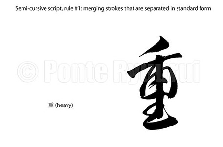 To read more on other rules of writing in semi-cursive script (行書), please see the the full list. This rule is identical with the rule #1 of writing in cursive script (草書), which says that certain strokes can be merged in one brush stroke. Naturally, semi-cursive script is not as laconic in form as cursive script, so even though similar rules apply to both scripts, the appearance of the same Chinese character will differ (in most cases). The diagram (above) shows the character 重 (heavy) written in semi-cursive script. This character counts 9 brush strokes in standard script (楷書). Semi-cursive script form of this Chinese character can be written in multiple ways, but the one shown in the picture has several strokes merged in one continuous brush stroke. Notice, that the 2nd, 3rd and 4th strokes are combine, and then 6th, 8th, 9th and 7th, as the last one, are also merged in one unbroken line. This form of semi-cursive script of the kanji 重 follows yet another rule of writing which will be discussed in a separate article. The stroke order of writing this character is altered, and the 7th stroke (vertical line) is written as the last one (watch below video to see how it is executed). Regardless of how much ink (墨) you have ground for your Chinese or Japanese calligraphy practice, or how long you intend to write, I would advise you not to dip the entire brush tuft inside the ink pool. Chinese calligraphy is supposed to be written with the tip of the brush (1/3rd of the brush tuft length). Naturally, there are exceptions. For example, modern calligraphy or any other over-expressive calligraphy styles, will invite you to writing with the whole tuft. Nevertheless, for calligraphy practicing (i.e. copying Chinese or Japanese calligraphy masterpieces), majority of writing will be executed with the 1/3rd of the brush tuft. Although I will be discussing the anatomy of the Chinese calligraphy brush separately (note: there are types of brushes used in Japanese calligraphy that differ in construction from the Chinese ones), I will mention here that the ink should be loaded into the space located inside the brush tuft, which is formed by longer and shorter hair arrangement. It is called "the stomach" (腹). The ink is stored there and it is being released during writing. The stomach of the brush is located in the upper half of the brush tuft. Thus, writing calligraphy with the lover 1/3 to 1/2 of the brush tuft, makes sense. Brush should not drip with ink, unless intentionally done so. It will case the paper to blur excessively. A paper that is too wet will tear much easier, too. As shown in the video (below), apply ink onto the brush by rotating and tapping the brush tuft against the inkstone (硯) grinding surface, in the direction of the brush tuft hair arrangement. Once loaded, the brush should be sharp and pointy, not crooked, and the tuft surface ought to be smooth and round (no sticking out hairs). Ink grinding is an art. Chinese calligraphy ink (墨) is traditionally prepared by grinding it with water on the inkstone. It looks easier than it really is. Here are few basic, but also very important things to bear in mind. The things you should n o t do: 1. Do not leave the ink in the pool of ground ink on the inkstone. One of the ingredients of ink used for Chinese calligraphy is animal glue (although other types of glue are also used in its production). If you leave an inkstick on the inkstone grinding surface (i.e. the "ink temple" / 墨堂), as shown in the middle picture below, it may stick to the inkstone and ruin it permanently. 2. Avoid grinding ink at steep angles (as shown in the left-hanbd side picture, below). Although some calligraphers prefer to grind ink at a steep angle to the grinding surface of the inkstone, it is much easier to control the pressure during grinding while the ink is ground. The old saying goes: "wield the brush with the power of a warrior, and inkstick with the power of a withered man". Finally, when the inkstick becomes too short to be held by hand, you can glue two types of the same ink together. If you grind ink at a steep angle, there is no way to join both pieces.
3. Do no press the inkstick with force against the inkstone temple. If you think it will help you to grind ink faster, then Chinese calligraphy is not for you. By doing so, you may not only ruin the inkstone, but also damage ink. The chipped particles of ink may then ruin a brush, or even tear paper. Also, the finest the particles of the ground ink, the easier it will be to write. So, be like a withered man. 4. Do not use a lot of water. A few drops will do. Grinding ink is a time consuming task, and it supposed to be a meditation, not a race. Again, if you are impatient, or you seek quick solutions, then Chinese calligraphy is not for you. Using too much water will result in lower quality ink liquid. Preparation if ink is all about consistency, colour and dryness / wetness of the ink. You need to consider the paper type you use, the brush (types and size), what script you write in, and also your personal preference. All those come with practice. The more you grind, the more you know how to grind. If you rush, you will not learn anything. The above video shows the proper way of ink grinding. Each ink (even the same type from the same factory) has different proprieties. There are all kinds of ink and all kinds of inkstones. Both are closely related. It is important to keep searching for a match between the ink stick and the inkstone. It is a quest on which every calligrapher is alone.
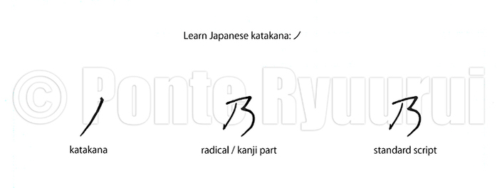 Japanese katakana syllabogram ノ is derived from the standard script (楷書) form of the Japanese kanji 乃 (possessive particle). If you look at the diagram above, you will notice that the shape of katakana ノ follows the left-hand side slanting stroke of the character 乃. Although the shape of katakana syllabogram ノ is different from the shape of hiragana syllabogram の, both syllabograms are based on the same Japanese kanji 乃.
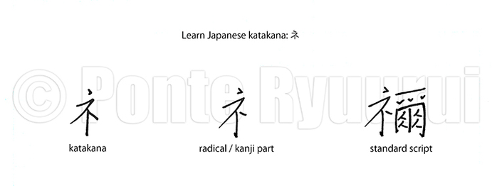 Japanese katakana syllabogram ネ is derived from the standard script (楷書) form of the Japanese kanji 禰 (ancestral shrine). If you look at the diagram above, you will notice that the shape of katakana ネ is idendical the one of the radical 礻 (cult, showing radical). Although the shape of katakana syllabogram ネ is different from the shape of hiragana syllabogram ね, both syllabograms are based on the same Japanese kanji 禰.
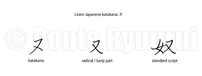 Japanese katakana syllabogram ヌ is derived from the standard script (楷書) form of the Japanese kanji 奴 (guy, slave). If you look at the diagram above, you will notice that the shape of katakana ヌ is very similar to the one of the radical 又 (or agian, furthermore). Although the shape of katakana syllabogram ヌ is different from the shape of hiragana syllabogram ぬ, both syllabograms are based on the same Japanese kanji 奴.
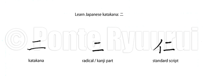 Japanese katakana syllabogram ニ is derived from the standard script (楷書) form of the Japanese kanji 仁 (benevolence). If you look at the diagram above, you will notice that katakana ニ follows the shape of the radical 二 (two), and it has the same stroke order. The shape of ニ is quite similar to the shape of hiragana syllabogram に. Both syllabograms are also based on the same Japanese kanji 仁.
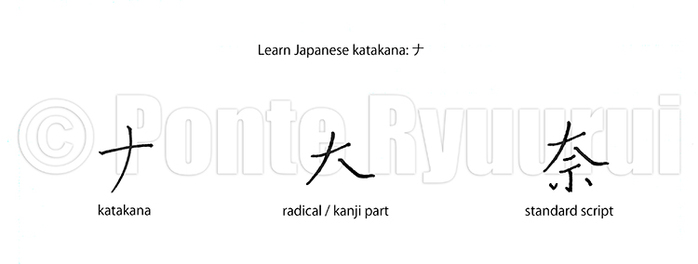 Japanese katakana syllabogram ナ is derived from the standard script (楷書) form of the Japanese kanji 奈 (Nara). If you look at the diagram above, you will notice that the shape of katakana ナ is very similar to the one of the upper radical of Chinese character 奈. Although the shape of katakana syllabogram ナ is different from the shape of hiragana syllabogram な, both syllabograms are based on the same Japanese kanji 奈.
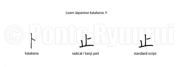 Japanese katakana syllabogram ト is derived from the standard script (楷書) form of the Japanese kanji 止 (stop, halt). If you look at the diagram above, you will notice that the shape of katakana ト folows the one of the first two strokes of kanji 止. Although the shape of katakana syllabogram ト is different from the shape of hiragana syllabogram と, both syllabograms are based on the same Japanese kanji 止. Do not confuse katakana ト with Chinese character卜 (fortune teling, divination).
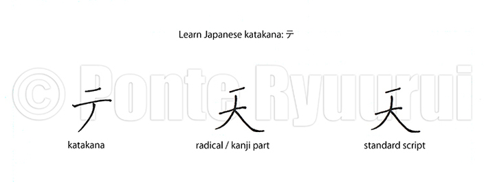 Japanese katakana syllabogram テ is derived from the standard script (楷書) form of the Japanese kanji 天 (heaven). If you look at the diagram above, you will notice that the shape of katakana テ is very similar to the one of kanji 天. Although the shape of katakana syllabogram テ is different from the shape of hiragana syllabogram て, both syllabograms are based on the same Japanese kanji 天.
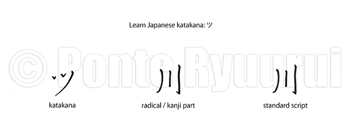 Japanese hiragana syllabogram ツ is based on the standard script (楷書) form of the Japanese kanji 川 (river). If you look at the diagram above, you will notice modification of the structire of strokes in the syllabogram ツ. Two last strokes are changed to to dots, and the first stroke to a curved line. Syllabogram ツ and kanji 川 follow the same stroke order. The shape of the katakana syllabogram ツ is quite similar to the shape of hiragana syllabogram つ. Both syllabograms are also based on the same Chinese character 川.
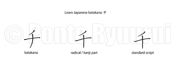 Japanese katakana syllabogram チ is derived from the standard script (楷書) form of the Japanese kanji 千 (thousand). If you look at the diagram above, you will notice that katakana チ is virtually identical with the shape of the Chinese character 千. Syllabogram チ and kanji 千 have the same stroke order.
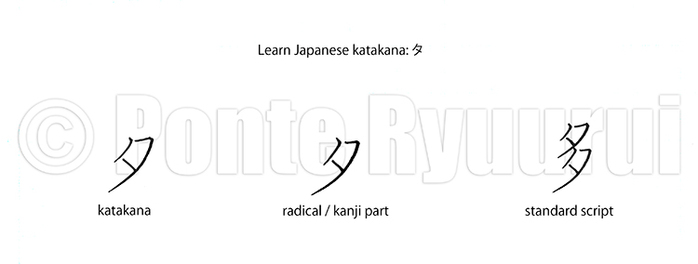 Japanese katakana syllabogram タ is derived from the standard script (楷書) form of the Japanese kanji 多 (many, frequent). If you look at the diagram above, you will notice that katakana タ follows the shape of the radical 夕(evening). Syllabogram タ is a simplification of the radical 夕, and it has the same stroke order.
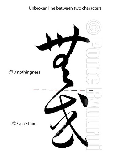 To read part 1 and 2 of this tutorials, please see the cursive script tutorials page. Visible unbroken line, that connects two or more characters (some masterpieces have lines with 20 characters or more being merged in a single brush stroke), is a technique often used by Chinese and Japanese calligraphers. The way of connecting two characters is not random, and it should by no means not distort the structure and balance of either of the Chinese characters. It is performed with a single brush stroke, without the brush leaving the paper surface. Merging more than 3 character with the unbroken line technique is more common in Japanese calligraphy than Chinese calligraphy. This tradition takes its origin in Japanese kana calligraphy, in which hiragana (平仮名) and hentaigana (変体仮名) syllabograms are combined in long ribbons of ink. There are also styles of calligraphy which are based on writing the entire text in one brush stroke, which I believe was initiated by a brilliant calligrapher of the late Ming Dynasty (明朝, 1368 - 1644), Wang Duo ( 王鐸, 1592 - 1652), who was inspired by the ippitsu technique (一筆書, lit. one brush stroke calligraphy) found in the Chinese calligraphy masterpieces by Wang Xianzhi (below) of the Jin dynasty (晉朝, 265 - 420). One of the most famous Chinese experts on the unbroken line, was Wang Xianzhi (王献之, 344 - 386), the 7th and most talented son of famous Wang Xizhi (王羲之, 303 - 361), though the unbroken line had appeared much earlier. It was a technique used already during the late Han Dynasty (漢朝, 206 B.C.E. - 220 C.E.) by a brilliant calligrapher, Zhang Zhi (張芝, died 192), who excelled in the cursive script (草書) of Chinese calligraphy. Visible unbroken line is very difficult to execute in a way that will not ruin the composition and the energy flow (行氣), which are the essential elements of good calligraphy. Diligent studies of cursive script masterpieces is a sine qua non step towards mastering this technique. Suggested calligraphers are, except those three mentioned above, Zhang Xu (張旭, he exact dates of birth and death are unknown) and the monk Huai Su (懷素, 737–799 C.E.), of the Tang dynasty (唐朝, 618 – 907), who are well known as “Crazy Zhang and Drunk Su (顛張醉素)".
|
Categories
All
AuthorPonte Ryuurui (品天龍涙) Archives
August 2020
|
 RSS Feed