|
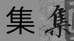
In modern times we all study from printed books or data published on the internet. There is no such things as handwritten books, and the only time we are in touch with handwritten form of any language is mostly through our own writing. When learning kanji (i.e. Chinese characters) we refer to shapes of characters printed in books or dictionaries. Our brain registers those shapes, and that is how we right those character by hand. In China or Japan, kids learn how to properly write characters with a brush, which is an obligatory subject. Now, one of the reasons, of such classes still existing, is that people learn much faster through hands-eyes coordinated actions. The other reason is much more practical. Many Chinese characters or Japanese kanji have very different appearance in a handwritten form. Certain radicals (i.e. parts from which kanji are constructed) can have multiple forms. For example, 心 (heart, mind, spirit, etc.), can be written as 心, 忄, or 㣺. All those forms are derived from the ancient divinatory script (甲骨文) and bronze texts (金文) of the Shang and Zhou dynasties (from ca. 6th century B.C.E. onwards), as well as the later clerical script (隷書). Other radicals can appear in a simplified form, to allow for easier reading. If you look at the images below, I picked three random characters from the famous "Preface to the Poems Collected from the Orchid Pavilion" (蘭亭集序) by Wang Xizhi (王羲之, 303–361). This masterpiece is written in semi-cursive script (行書), which is the script most of the people would choose for casual writing.
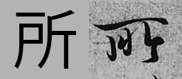
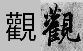
Looking from the left to right we have 集 (to gather), 所 (place) and 観 in its traditional form of 觀 (appearance). The bottom radical 木 (tree) written at the bottom of a character will (in most cases) be a combination of 十 with two dots on both sides. This way of writing is more aesthetically appealing, and the whole structure looks much lighter in form, which improves the overall composition of given kanji.
If you look at the second character (所) it looks very differnt from its computer version. This particular form was derived from the later clerical script (隷書) forms of 所, particularly the top long horizontal stroke. The third character's top-left part is known as the ”grass crown" radical, which also has many versions (艸,艹,艹,艹). It is almost never written the way you see it in the computer font. It would simply be too heavy and unsophisticated. Then the two 口 (mouth) radicals are simplified to dots, which is common in semi-cursive writing. There are thousands and thousands of characters that look differently in a written form, and the only way to master those forms is through copying or viewing the ancient masterpieces, as well as the analysis of different calligraphy script. |
Categories
All
AuthorPonte Ryuurui (品天龍涙) Archives
August 2020
|
 RSS Feed
