 Unlike Chinese calligraphy, Japanese calligraphy utilises several different writing systems. Those are: kanji (漢字), katakana (片仮名), and hiragana (平仮名) the writing systems known to anyone who studies modern Japanese language, but also hentaigana (変体仮名), manyōgana (万葉仮名), and so on.
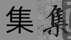
To understand the history of Japanese calligraphy, it is best if you read my article on the subject. However, for the sake of better understanding of this article, it is necessary to say a few more words in regards to those writing systems. Japanese kanji evolved from Chinese characters. Since Japanese grammar is completely different from the Chinese one, there was a need for developing a writing system to be used for distinguishing prefixes, grammatical expressions, etc. Today, hiragana syllabary is used for dealing with grammatical issues, and katakana is mostly used for writing foreign names and as phonetic explanatory notes. Historically speaking, various different types of Japanese calligraphy have evolved, depending on which writing system, or writing systems, are applied in a single calligraphy work. For instance, the calligraphy you see in the picture (above), is a typical kana majiri bun (仮名交じり文), which stands for: "a text that is a mixture of kana and kanji". Another type would be chōwatai (調和体), which stands for "harmony of scripts". Such calligraphy can include both kana syllabaries and kanji, similarly to kana majiri bun, but the forms of characters or syllabopgrams are based on those found in classical literature. In this respect kana majiri bun is a modern form of chōwatai. Last but not least, there is also kana script (かな), which refers to calligraphy written exclusively in hiragana and / or hentaigana. Pictured calligraphy: 果てしない夏(の)愛 (everlasting summer love) In modern times we all study from printed books or data published on the internet. There is no such things as handwritten books, and the only time we are in touch with handwritten form of any language is mostly through our own writing. When learning kanji (i.e. Chinese characters) we refer to shapes of characters printed in books or dictionaries. Our brain registers those shapes, and that is how we right those character by hand. In China or Japan, kids learn how to properly write characters with a brush, which is an obligatory subject. Now, one of the reasons, of such classes still existing, is that people learn much faster through hands-eyes coordinated actions. The other reason is much more practical. Many Chinese characters or Japanese kanji have very different appearance in a handwritten form. Certain radicals (i.e. parts from which kanji are constructed) can have multiple forms. For example, 心 (heart, mind, spirit, etc.), can be written as 心, 忄, or 㣺. All those forms are derived from the ancient divinatory script (甲骨文) and bronze texts (金文) of the Shang and Zhou dynasties (from ca. 6th century B.C.E. onwards), as well as the later clerical script (隷書). Other radicals can appear in a simplified form, to allow for easier reading. If you look at the images below, I picked three random characters from the famous "Preface to the Poems Collected from the Orchid Pavilion" (蘭亭集序) by Wang Xizhi (王羲之, 303–361). This masterpiece is written in semi-cursive script (行書), which is the script most of the people would choose for casual writing.
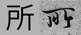
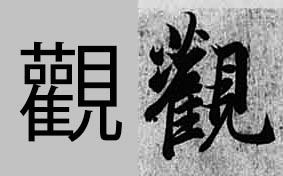
Looking from the left to right we have 集 (to gather), 所 (place) and 観 in its traditional form of 觀 (appearance). The bottom radical 木 (tree) written at the bottom of a character will (in most cases) be a combination of 十 with two dots on both sides. This way of writing is more aesthetically appealing, and the whole structure looks much lighter in form, which improves the overall composition of given kanji.
If you look at the second character (所) it looks very differnt from its computer version. This particular form was derived from the later clerical script (隷書) forms of 所, particularly the top long horizontal stroke. The third character's top-left part is known as the ”grass crown" radical, which also has many versions (艸,艹,艹,艹). It is almost never written the way you see it in the computer font. It would simply be too heavy and unsophisticated. Then the two 口 (mouth) radicals are simplified to dots, which is common in semi-cursive writing. There are thousands and thousands of characters that look differently in a written form, and the only way to master those forms is through copying or viewing the ancient masterpieces, as well as the analysis of different calligraphy script. 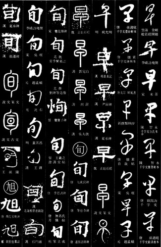 Chinese writing is the oldest writing system on our planet. It precedes Sumerian cuneiform by at least some 1500 years, going all the way back to the Yangshao culture (仰韶文化; 5000 – 2000 B.C.E.). It is also the most advanced writing system that human race managed to develop. We know for a fact that the total number of Chinese characters exceeds 90,000. If one compares this against the 23 letters of the Latin alphabet, it makes one wonder how such overwhelming number of character is organised. Ancient forms of Chinese characters are often mistaken for pictographs, hieroglyphs, and in extreme cases, letters. It is so, because our Western minds see differently than a Chinese or Japanese person. It also has to do with the nature of art and differences in aesthetics between the West and the East. In great simplification, Far Eastern art underwent a transformation from very abstract and symbolic to one infused with more realism. The art of the Western side of the world went through the exact opposite process; from realism to abstractionism. Consequently, a Chinese person looking at calligraphy work of the character 海 (sea) will sense the power of water, anger of waves, or suppleness of the water, its life giving ability, or element of clarity and spiritual purity. Westerner will see waves, water droplets, and sea foam. He or she will most likely seek a shape of something they can relate to in real life. Hieroglyph is from Greek, and it means “sacred writing”. Hieroglyphs differ from pictographs. One could say that they are onomatopoeic pictographs, i.e. characters that depict a given shape of an object and bear the same sound as that object. For instance a hieroglyph for a bird will resemble the shape of a bird and will have the sound “tweet”, etc. A pictograph is a character that is a physical representation of the shape of whatever it stands for. So a character for horse will resemble the shape or characteristic features of a horse. Chinese characters are divided into 6 groups. Those are: 1. Characters of pictographic origin (象形文字) 2. Phono-semantic characters (形声文字) 3. Compound ideographs (会意文字) 4. Rebus (phonetic loan) characters (仮借文字) 5. Indicative ideographs (指事文字) 6. Reciprocal meaning characters (転注文字) In Japan there is also one more category, known as National Characters (国字), i.e. characters artificially created from two or more characters or radicals. The above 6 groups are known as Liùshū (六書), i.e. “Six methods (of forming Chinese characters)”. The first book that mentioned this theory was the Confucian classic, the Book of Rites (周禮), also known as Rites of Zhou, from the 2nd century B.C.E. However, the first true analysis of this theory appears in the famous book by a Han dynasty philologist, Xǔ Shèn (許慎, ca. 58 CE – ca. 147), entitled “Explaining Simple (Characters) and Analysing Compound Characters” (說文解字), written some 4 centuries later. By far, the largest group of Chinese characters are the phono-semantic characters. 85% – 90% of Chinese characters belong to this group. That includes a vast majority of the most ancient Chinese calligraphy scripts, such as bronze inscriptions (金文) or oracle bone script (甲骨文). Each of the phono-semantic characters is constructed of two compounds; one phonetic, and one semantic. Compound ideographs form a group of characters that are a combination of two or more pictographs, or characters whose meaning was based on an abstract concept. So, a character composed of two pictographs is NOT a pictograph (see also this article of mine). Phonetic loan characters define a group of characters that were borrowed phonetically to write another homophonic word. Consequently, their original meaning (ancient meaning) can be completely different from that such characters may represent in later historical stages. For instance, the character 早, initially it had nothing to do with the time (modern meaning: “early”, “early morning”, etc.). Its ancient meaning was “a flea” (蚤). Here is a quote from my upcoming book: “The original meaning of 早 (zǎo, i.e. “early”) was 蚤 (zǎo, i.e. “a flea), and vice versa (i.e. 蚤 often was used to express “earliness”),. Note that both characters have identical pronunciation and tone (zǎo). There are numerous examples of interchangeable use of both characters. For instance, in the Lí Lóuzhāng gōu (離婁章句) by Mèngzǐ (孟子, 372 – 289 B.C.E.), a Confucian philosopher, we read: 蚤起 (zǎoqǐ), i.e. “to wake up early”. “ Indicative ideographs are a group of characters that express simple abstract concepts. Here is yet another quote from my new book: “One of the theories says that the shape of kanji 一 (i.e. "one) is based on that of suànchóu (算筹), which were divination rods (small wooden sticks, similar in size to matches, but longer and thicker). They were also used for calculations in ancient China, hence their name: “counting rods”. Most of the literature offer an explanation that the character 一 is a pictograph of an extended finger. However, the analysis of other numbers (2 to 9 ) clearly supports the theory of it being an ideograph.
Reciprocal meaning characters are what you may refer to as the grey area of Chinese or Japanese linguistics. It is the smallest and the most confusing group of all six. Those are characters whose meaning was extended. For instance, a character 樂 means “music”, but it was extended to “fun”, “pleasure”, “comfort”, or even “happy”, “joyful”, etc. Due to the complexity of Chinese writing system, the extended period of thousands of years of evolution, and great variety of possible approaches to the subject of etymology, various sources may classify given character differently. 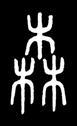 There is much confusion on the subject of how to classify Japanese kanji or, in other words, Characters of Han China (漢字). I often see websites, or even books, devoted to Japanese language and culture, where we read this and that about Japanese letters, or Chinese symbols, or anything equally intellectually challenged.
To elaborate on the title of this article, we need to look at the definition of the word "letter" first. Letter is a stand alone linguistic unit of a written language representing one or more of the sounds used in speech. Letters form alphabets. Letters DO NOT bear any meaning. The Japanese word 文字 (moji) means "a character" or "characters". It is often shortened to 字. But the character 字 also means "letter", "symbol", "word", etc. It would seem that the phrase "Japanese letter", or "Japanese symbol" is yet another erroneous translation from Japanese to English, or from Chinese to English, as if we did not have enough of those laying about (see my article where I talk about the "grass script"). Chinese character (or Japanese kanji), unlike letters, may have multiple meanings, and they DO NOT form an alphabet, but a writing system based on logographic characters (or ideographic logograms). Chinese characters are also known as sinographs. There are six major groups into which one can divide Japanese kanji. I will discuss this in separate articles. Last but not least, only because you see an ancient Chinese character, such as the one you see in the picture above, it does not necessarily mean it has to be a pictograph. This particular kanji is 森 (Japanese: mori, i.e. woods), and although it is composed of three pictographs of a tree (木, Japanese: ki), it belongs to a group of characters that are a combination of two or more pictographs, or characters whose meaning is based on an abstract concept. This group is known in Japanese as 会意文字 (kai-i moji). Characters of pictographic origin form one of the six groups of Chinese characters. In other words, some of the Chinese characters are pictographs, but this group of characters is not that large at all. There are over 90,000 (yes, you read correctly, it is ninety thousand) Chinese characters out there. 85% - 90% of them belong to a group known as the samasio-phonetic compound characters (形声文字, Japanese: keisei moji). Such characters, as the name suggests, are composed of semantic and phonetic radicals. Summarizing, do not trust blindly "serious" literature on the subject of Chinese or Japanese linguistics. For example, I can tell you now, that ALL books that I saw on the etymology of Chinese characters are either entirely incorrect, or incorrect in a large part. Those are either based on no research at all, or a research done so poorly, that the authors should pay damages to whoever buys their books. Often times authors base whatever they write on other English authors, who are also wrong, or on outdated research preceding the discovery and analysis of the oracle bone script (甲骨文). I am currently working hard on changing this unacceptable status quo, on which subject I will be able to update you in next month or two. 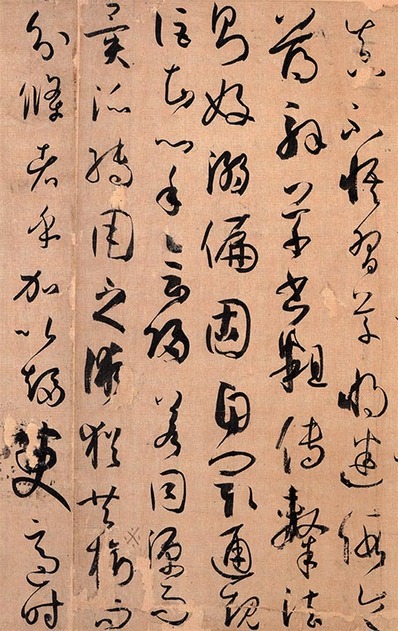 Writing in cursive hand could be compared to a skilled martial artist, who does not think, but reacts instinctively when performing various techniques. Constant and extensive studies are the only path to mastering this script. In the history of Chinese calligraphy art, there were a few calligraphers whose cursive script skills were beyond human perception. Those were, Dù Dù (杜度, early 1st century C.E.), Cuī Yuàn (崔瑗, 77-142 C.E.) , Zhāng Zhī (張芝, died 192 C.E.), the sage of cursive hand Zhāng Xù (張旭, 8th century C.E.), who was also the creator of wild cursive hand (狂草, kuáng cǎo), Huái Sù (懷素, 737–799), the brilliant drunk monk, the Two Wangs: Wáng Xīzhī (王羲之, 303–361) , the sage of calligraphy, and his son Wáng Xiànzhī (王獻之, 344 – 386), Sūn Guòtíng (孫過庭, 646–691), also known as Sūn Qiánlǐ (孫虔禮) whose Treaties on Calligraphy (書譜) is not only a well of knowledge on calligraphy but also a bible of cursive script forms (see a fragment of this masterpieces in the picture to the left), and Xiān Yú Shū (鮮于樞, 1246 – 1302). Naturally, this list does not exhaust the list of brilliant Chinese calligraphers, who excelled in cursive script. You can view and read about the masterpieces of some of those Masters, here.
Very popular way of studying cursive script is by performing rinsho (臨書, lit. “facing and writing”, i.e. copying of masterpieces) of “Thousand Characters Essay” (千字文), an essay (written as a rhyming poem) composed of 1000 non repeating Chinese characters, in the first half of 6th century C.E., by Zhōu Xīngsì (周興嗣, died in 521), upon the order of the Emperor Liáng Wǔ (梁武帝, 464 - 549), for the sole purpose of calligraphy education. Many great calligraphers copied this text imbuing it with their own style, writing it in two, three or even more forms, one aside another. Reading and copying standard (楷書), semi-cursive (行書) and then cursive forms character after a character is considered one of the best and most proper ways of beginning and continuing studies of Chinese calligraphy. |
Categories
All
AuthorPonte Ryuurui (品天龍涙) Archives
August 2020
|
 RSS Feed
