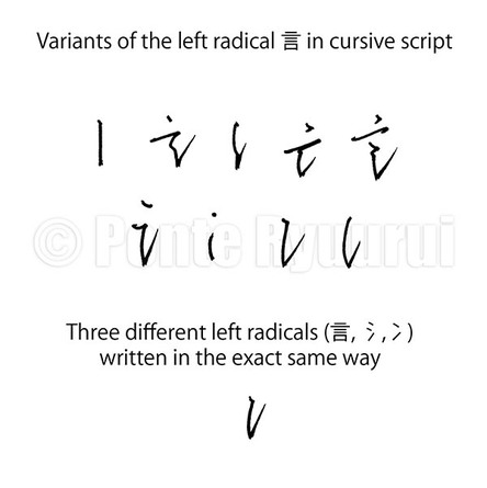
 Simplifying certain radicals in cursive hand carries dangers. Left-hand side radicals such as 言 (gen, i.e. “word”), 氵 (sanzui, i.e. “water radical”), and 冫 (ni sui, i.e. “ice radical”), can be written in the exact same way. Therefore, the only way of deciphering the meaning of the given text will be either studying the right-hand side of the character, or guessing it from the context, which by the way will be quite intuitive in cursive script. On the other hand, one radical can be written in various manners. If we take 言 as an example then it can appear in one of the forms shown in the picture (left).
Chinese calligraphy in cursive script is, or ought to be, written without thinking or planning. Any pondering or hesitation will ruin the flow of precious energy. Thus, there is no time for deciding how to write given character. It happens automatically. And since some characters have repeating radicals, it is the calligrapher’s mastery level of the art that will determine how rich in various forms the text will be. None of the Chinese scripts is rule free. Cursive hand is no exception here. These are: 1. Merging strokes that are separated in standard form 2. Changing the starting point of a following stroke 3. Dots merged in one single line 4. Straight lines are represented by curved lines, sharp corners by loops 5. Reduction of total number of strokes 6. Long lines are shortened or symbolised by dots 7. Complex radicals are significantly simplified 8. There is a change in a positioning of given stroke 9. Stroke order is altered 10. Starting point of an initial stroke is changed This does not exhaust the subject of cursive script. Its another very characteristic feature is so called “unbroken line” (連綿体i). This technique is also essential in Japanese kana script, which was based on cursive forms of Chinese characters, or more precisely, manyōgana (万葉仮名, lit. "kana of ten thousand leaves [words]"). The “unbroken line” is the connection, be it visible or not, between the characters. In other words, an instance where two or more Chinese characters are literally or metaphysically combined into one flow. If a calligrapher was to stop after each Chinese character, and think how or where to write the next one, the flow would be broken. The secret of the rhythm and beauty of cursive hand lies in both well balanced forms of the characters, as well as the natural appearance of the composition, that allows the eye of the reader to glide with ease down the row of Chinese characters. “Unbroken line” seeks its way through a page of paper as a mountain creek searches for the shortest way to the sea. The undisturbed flow of energy (行氣) is the beating heart of cursive hand.  Cursive script is extremely intriguing. It is difficult to read, write and even to place its origin on a timeline (see this link to read my articles on the history of calligraphy and calligraphy scripts). Its definition is irregular and very flexible, just like its appearance. Even though it was, and still is in some cases, the most common script used daily by all the nations whose language is based on Chinese characters, not many of the modern native speakers can actually decipher it, let alone apply it with natural fluency in every day written communication. Modern civilization and computerisation of lives is to blame. It is no wonder, however, that the vast possibilities of expressing oneself are the reason for so many calligraphers to prefer to write in cursive hand. It is dynamic, abstract, passionate, favours subconscious creativity, and it is extremely expressive. Calligraphy written in cursive script may seem to be a maze of random brush strokes, or a late Picasso painting of anaconda snakes mating in their nest, but the paradoxical feature of it is that despite its random looks, cursive script requires a lot of precision and knowledge. 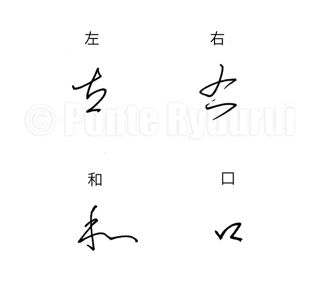 The studies of cursive script are long and taxing, starting with learning the basics of standard (楷書), semi-cursive (行書), and clerical scripts (隷書). Even though, historically speaking, cursive script preceded semi-cursive and standard scripts, it could be seen as an allegory for all three. The concept of cursive script is to emphasise the most characteristic features of the characters, and simplify them into a form that allows for faster and more fluent writing. However, those “shortcuts” are not any near being random, but rather carefully designed blueprints by some 2000 years of practical use.
There are two major factors of cursive script that define its complexity. First one is that to writing in a way that brush is lifted from the paper surface as few times as possible (see my articles on the “unbroken line”). The second one is omitting and simplifying certain parts of a characters. As you may know, Chinese characters are built of radicals. Some characters may have completely different meaning, even if they share the same radicals (or radicals that look identically or nearly identically in modern standard script form). For instance 左 (hidari) means “left”, whereas 右 (migi) means “right”. The appearance of the 𠂇 (Japanese: sa, i.e. pictograph of a hand) seems to be nearly identical in both characters in the standard script, but its cursive forms will differ. This is because the etymology of the character 左 tells us that 𠂇 depicts the left hand, and in 右 it depicts the right hand. The stroke order of both differs in seal script (篆書), hence the difference in writing in cursive script. The stroke order of writing both characters in standards script also differs. Those may seem like small nuances, but such details have a massive impact on the composition and the flow of writng. Even in the case of a simple radical 口 (kuchi, i.e. “mouth”), the cursive forms might, or might not, have similar shapes. It all depends on the overall appearance of given character, or the calligraphy work composition. For example, it is possible that a cursive form of the Chinese character 口 in 右 may be written in a completely different way than that in 和 (wa, “harmony”), and usually it is so (see the diagram above). I invite you to view my tutorial on cursive script (videos included) 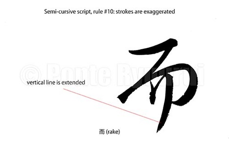 Links to the other 9 articles on writing rules in semi-cursive script (行書), are to be found here. Unlike in standard script (楷書), the structure of Chinese characters written in semi-cursive script is more relaxed, and sometimes even distorted on purpose. Calligraphers use this to their advantage in order to create more expressive calligraphy art. The exaggeration of stroke(s) usually counterweights other over accented parts of a given character, or even the whole text. It is an important thing to bear in mind, that good calligraphy is not about every character being written correctly or harmoniously, but about the mutual communication among the characters in the entire work. The above diagram shows the last stroke of the character 而 (Japanese: rake / Chinese: as well) has its last vertical stroke intentionally extended. It adds more drama and kinetic energy to the appearance of this character. Exaggerating of the strokes should be performed with caution, as there are limits to it, and not all strokes can be (or should be) distorted this way. 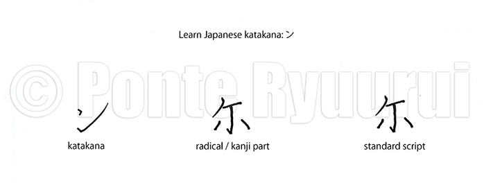 Japanese katakana syllabogram ン is derived from the simplified standard script (楷書) form of the Japanese kanji 爾 (you, though), i.e. 尓. If you look at the diagram above, you will notice that the shape of katakana ン follows the general stgructure of the top part of the Chinese character 尓, and it has the same stroke order. 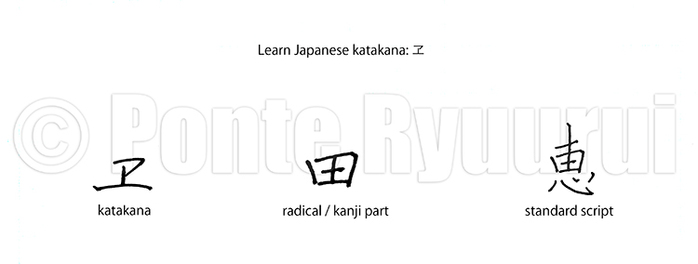 Japanese katakana syllabogram ヱ is derived from the simplified standard script (楷書) form of the Japanese kanji 惠 (blessing, grace), i.e. 恵. If you look at the diagram above, you will notice that the shape of katakana ヱ follows the general structure of the radical 田 (field), and it has the same stroke order. Although the shape of katakana syllabogram ヱ is different from the one of hiragana syllabogram ゑ, both syllabograms are based on the same Chinese character 恵. 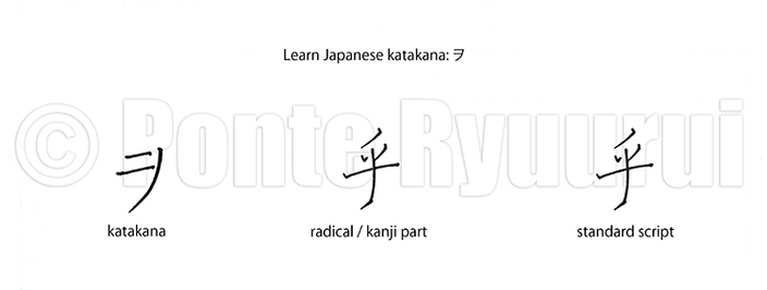 Japanese katakana syllabogram ヲ is derived from the standard script (楷書) form of the Japanese kanji 乎 (question mark). If you look at the diagram above, you will notice that the shape of katakana ヲ follows the general stgructure of the Chinese character 乎, but its stroke order differs slightly. 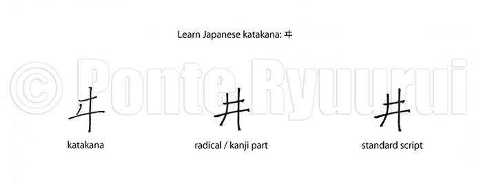 Japanese katakana syllabogram ヰ is derived from the standard script (楷書) form of the Japanese kanji 井 (a well). If you look at the diagram above, you will notice that the shape of katakana ヰ follows the general stgructure of the Chinese character 井, and it has the same stroke order. 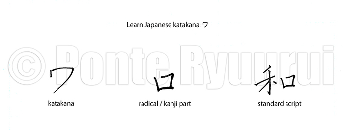 Japanese katakana syllabogram ワ is derived from the standard script (楷書) form of the Japanese kanji 和 (harmony). If you look at the diagram above, you will notice that the shape of katakana ワ is similar to the one of the radical 口 (mouth, rutual vessel), and it has the same stroke order. Although the shape of katakana syllabogram ワ is different from the shape of hiragana syllabogram わ, both syllabograms are based on the same Japanese kanji 和. 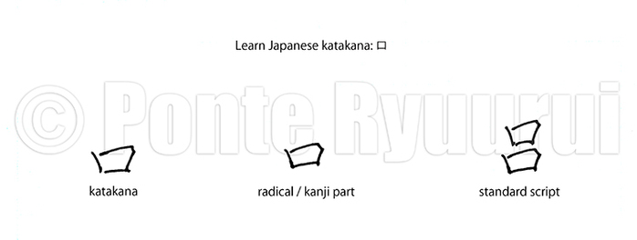 Japanese katakana syllabogram ロ is derived from the standard script (楷書) form of the Japanese kanji 呂 (spine, backbone). If you look at the diagram above, you will notice that the shape of katakana ロ is identical to the radical 口 (mouth, rutual vessel), and it has the same stroke order. Although the shape of katakana syllabogram ロ is different from the shape of hiragana syllabogram ろ, both syllabograms are based on the same Japanese kanji 呂.
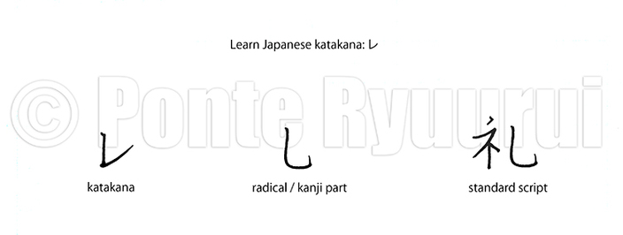 Japanese katakana syllabogram レ is derived from the simplified standard script (楷書) form of the Japanese kanji 禮 (social customs, manners), i.e 礼. If you look at the diagram above, you will notice that the shape of katakana レ follows the central structure of the character 礼, and it has the same stroke order. Although the shape of katakana syllabogram レ is different from the shape of hiragana syllabogram れ both syllabograms are based on the same Japanese kanji 礼. 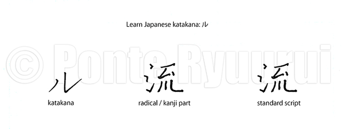 Japanese katakana syllabogram ル is derived from the standard script (楷書) form of the Japanese kanji 流 (to flow). If you look at the diagram above, you will notice that the shape of katakana ル follows the bottom part of the character 流, and has the same stroke order. 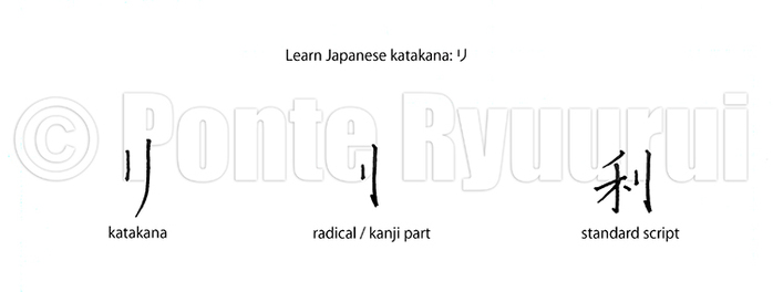 Japanese katakana syllabogram リ is derived from the standard script (楷書) form of the Japanese kanji 利 (advantage, benefit). If you look at the diagram above, you will notice that the shape of katakana リ is identical to the one of the sword radical (刂), and it has the same stroke order. Katakana syllabogram リ and the hiragana syllabogram り have very similar appearance.
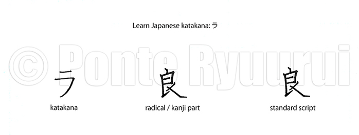 Japanese katakana syllabogram ラ is derived from the standard script (楷書) form of the Japanese kanji 良 (good). If you look at the diagram above, you will notice that the shape of katakana ラ follows the top-right structure of the character 良, and it has the same stroke order. Although the shape of katakana syllabogram ラ is different from the shape of hiragana syllabogram ら, both syllabograms are based on the same Japanese kanji 良. 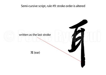 To read more on other rules of writing in semi-cursive script (行書), please see the the full list. There are many variants of stroke order when it comes to writing Chinese characters. The same character written by Chinese, Japanese, Taiwanese or Korean calligrapher, may have a different stroke order. In case of the character 耳 (ear), the Japanese stroke order varies from the Chinese one. The long vertical stroke is written as the last one in Japan, whereas in China it is the 3rd stroke. Now, since we are discussing Chinese calligraphy script, I will follow the Chinese stroke order. Consequently, if the long vertical stroke is written as the last one in semi-cursive script (although it does not have to be so), then the stroke order is changed. If you watch the video (below), you will understand why it feels more natural to change the stroke order in semi-cursive script, in this particular case. Being based on the concept of the unbroken line (連綿), alteration of the stroke order allows for faster and more fluent writing. 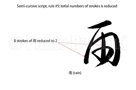 More about other rules of writing Chinese calligraphy in semi-cursive script (行書), here. The reduction of strokes is one of the main purposes of semi-cursive and cursive (草書) scripts. It allows for more fluent and emotional writing. This rule of writing corresponds with the technique used in both Chinese and Japanese calligraphy art, known as unbroken line (連綿). In the diagram (top left), you can see kanji 雨 (rain), which has 8 strokes in standard script. The pictured semi-cursive form was written with two brush strokes only. It is to be said that virtually nearly any rule of writing calligraphy stays in close relation to other rules. For instance, you will notice that the 4 dots of of the Chinese character 雨 were merged into a single curved line, which would be the rule #3 of semi-cursive and cursive scripts. 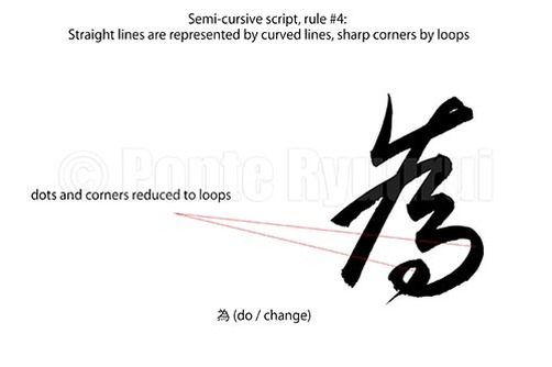 See my other tutorials on semi-cursive script (行書), here. This is very similar rule to the one of cursive script (草書), where corners and straight lines are round up to loops. The diagram (left) shows a character 為 (do / change) written in semi-cursive script. You will notice that the entire composition was softened, in comparison to the standard script (楷書) form of this character. Marked are the corner strokes, which are converted into a curved line (5th stroke), and a loop (4 dots and and hook are simplified). Such modifications are not as common and as over emphasised as it can be observed in cursive script form of this, and other, characters. Chinese calligraphy does not offer a recipe for simplifying lines and corners with loops, and diligent studies of the Chinese masterpieces are a sine qua non stage on the path to intuitive understanding of how to apply this rule in practice. 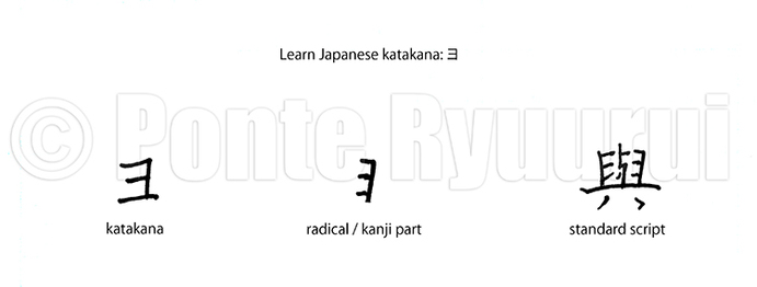 Japanese katakana syllabogram ヨ is derived from the standard script (楷書) form of the Japanese kanji 與 (participate in, give). If you look at the diagram above, you will notice that the shape of katakana ヨ follows the right-hand side part of the radical 𦥑 (milestone, mortar), and it has the same stroke order. Although the shape of katakana syllabogram ヨ is different from the shape of hiragana syllabogram よ both syllabograms are based on the same Japanese kanji 與. 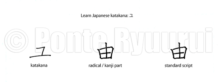 Japanese katakana syllabogram ユ is derived from the standard script (楷書) form of the Japanese kanji 由 (reason). If you look at the diagram above, you will notice that the shape of katakana ユ follows the central structure of the character 由, but has a different stroke order. Although the shape of katakana syllabogram ユ is different from the shape of hiragana syllabogram ゆ both syllabograms are based on the same Japanese kanji 由.
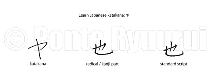 Japanese katakana syllabogram ヤ is derived from the standard script (楷書) form of the Japanese kanji 也(to be). If you look at the diagram above, you will notice that the shape of katakana follows the central structure of the character 也, and it has the same stroke order Although the shape of katakana syllabogram ヤ is different from the shape of hiragana syllabogram や both syllabograms are based on the same Japanese kanji 也. 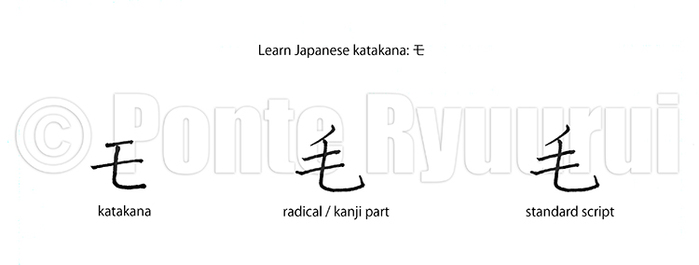 Japanese katakana syllabogram モ is derived from the standard script (楷書) form of the Japanese kanji 毛(hair, fur). If you look at the diagram above, you will notice that the shape of katakana モ is identical to the bottom part of the Chinese character モ, and it follows the same stroke order Although the shape of katakana syllabogram モ is different from the shape of hiragana syllabogram も, both syllabograms are based on the same Japanese kanji 毛. 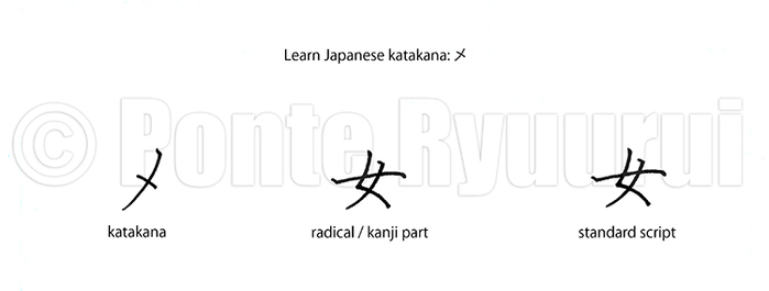 Japanese katakana syllabogram メ is derived from the standard script (楷書) form of the Japanese kanji 女 (woman). If you look at the diagram above, you will notice that the shape of katakana メ follows the shape of of a small part of the second half of the first stroke, and the last stroke of the Chinese charatcer 女. The stroke order of メ is different that the one of the kanji 女. Although the shape of katakana syllabogram メ is different from the shape of hiragana syllabogram め both syllabograms are based on the same Japanese kanji 女.
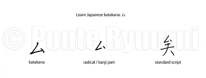 Japanese katakana syllabogram ム is derived from the standard script (楷書) form of the Japanese kanji 矣 (sentence particle). If you look at the diagram above, you will notice that the shape of katakana ム is identical to the one of the radical 厶 (I, myself). Also, note that the hand written shape of the kanji 矣 misses one stroke. Hand written characters offen differ from their printed font counterparts. 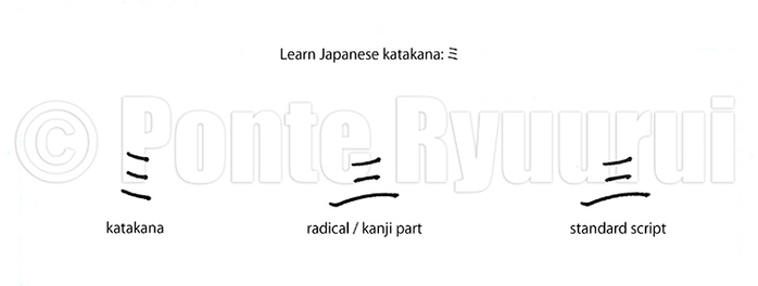 Japanese katakana syllabogram ミ is derived from the standard script (楷書) form of the Japanese kanji 三 (three). If you look at the diagram above, you will notice that the shape of katakana ミ is identical to the one of kanji 三, and has the same stroke order. 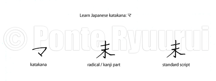 Japanese katakana syllabogram マ is derived from the standard script (楷書) form of the Japanese kanji 末 (top end, tip). If you look at the diagram above, you will notice that the shape of katakana マ follows the top part of the kanji 末. Although the shape of katakana syllabogram マ is different from the shape of hiragana syllabogram ま, both syllabograms are based on the same Japanese kanji 末. 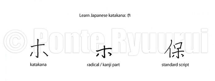 Japanese katakana syllabogram ホ is derived from the standard script (楷書) form of the Japanese kanji 保 (protect, guarantee). If you look at the diagram above, you will notice that the shape of katakana ヒ is identical to the hand written shape of the radical 木 (tree), and follows the same stroke order Although the shape of katakana syllabogram ホ is different from the shape of hiragana syllabogram ほ, both syllabograms are based on the same Japanese kanji 保. |
Categories
All
AuthorPonte Ryuurui (品天龍涙) Archives
August 2020
|
 RSS Feed
