|
I created this short clip today to show those of you who study Chinese or Japanese calligraphy the brush flow during and in between the brush strokes in semi-cursive script. If you are not acquainted with the concept of unbroken line, I strongly suggest you read and watch my other video tutorials on the subject. It is absolutely essential not only for semi-cursive script studies, but Chinese or Japanese calligraphy in general. The classic I write in this video is composed out of characters written by the calligraphy sage, Wang Xizhi, of the Jin Dynasty in China. Enjoy! For more calligraphy tutorials and information, see the learning section on this website. Photo editing & Chinese and Japanese calligraphy tutorial videos Buy fine art calligraphy prints at my store in my store on Fina Art Amercia. 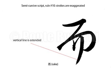 Links to the other 9 articles on writing rules in semi-cursive script (行書), are to be found here. Unlike in standard script (楷書), the structure of Chinese characters written in semi-cursive script is more relaxed, and sometimes even distorted on purpose. Calligraphers use this to their advantage in order to create more expressive calligraphy art. The exaggeration of stroke(s) usually counterweights other over accented parts of a given character, or even the whole text. It is an important thing to bear in mind, that good calligraphy is not about every character being written correctly or harmoniously, but about the mutual communication among the characters in the entire work. The above diagram shows the last stroke of the character 而 (Japanese: rake / Chinese: as well) has its last vertical stroke intentionally extended. It adds more drama and kinetic energy to the appearance of this character. Exaggerating of the strokes should be performed with caution, as there are limits to it, and not all strokes can be (or should be) distorted this way. 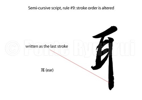 To read more on other rules of writing in semi-cursive script (行書), please see the the full list. There are many variants of stroke order when it comes to writing Chinese characters. The same character written by Chinese, Japanese, Taiwanese or Korean calligrapher, may have a different stroke order. In case of the character 耳 (ear), the Japanese stroke order varies from the Chinese one. The long vertical stroke is written as the last one in Japan, whereas in China it is the 3rd stroke. Now, since we are discussing Chinese calligraphy script, I will follow the Chinese stroke order. Consequently, if the long vertical stroke is written as the last one in semi-cursive script (although it does not have to be so), then the stroke order is changed. If you watch the video (below), you will understand why it feels more natural to change the stroke order in semi-cursive script, in this particular case. Being based on the concept of the unbroken line (連綿), alteration of the stroke order allows for faster and more fluent writing. 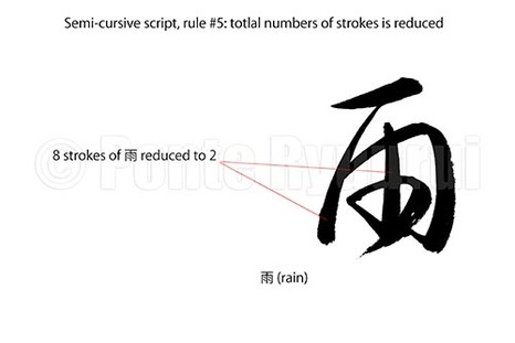 More about other rules of writing Chinese calligraphy in semi-cursive script (行書), here. The reduction of strokes is one of the main purposes of semi-cursive and cursive (草書) scripts. It allows for more fluent and emotional writing. This rule of writing corresponds with the technique used in both Chinese and Japanese calligraphy art, known as unbroken line (連綿). In the diagram (top left), you can see kanji 雨 (rain), which has 8 strokes in standard script. The pictured semi-cursive form was written with two brush strokes only. It is to be said that virtually nearly any rule of writing calligraphy stays in close relation to other rules. For instance, you will notice that the 4 dots of of the Chinese character 雨 were merged into a single curved line, which would be the rule #3 of semi-cursive and cursive scripts. 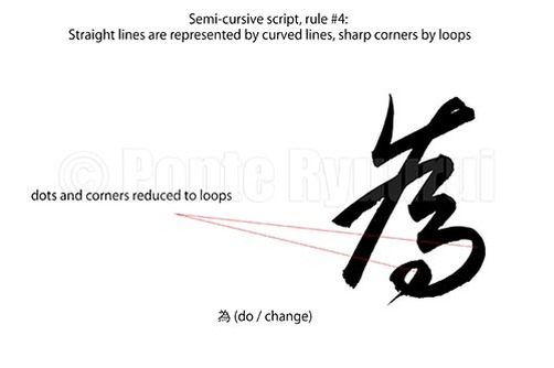 See my other tutorials on semi-cursive script (行書), here. This is very similar rule to the one of cursive script (草書), where corners and straight lines are round up to loops. The diagram (left) shows a character 為 (do / change) written in semi-cursive script. You will notice that the entire composition was softened, in comparison to the standard script (楷書) form of this character. Marked are the corner strokes, which are converted into a curved line (5th stroke), and a loop (4 dots and and hook are simplified). Such modifications are not as common and as over emphasised as it can be observed in cursive script form of this, and other, characters. Chinese calligraphy does not offer a recipe for simplifying lines and corners with loops, and diligent studies of the Chinese masterpieces are a sine qua non stage on the path to intuitive understanding of how to apply this rule in practice. 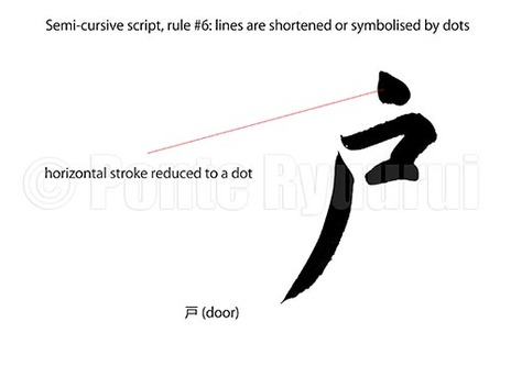 To learn about other rules of writing in semi-cursive script (行書), follow this link. This rule corresponds with the rule #6 of writing Chinese calligraphy in cursive script (草書). The concept is very similar, and the aim is to reduce the characters structure and make it more compact. Also, it speeds up writing, which is one of main purposes of semi-cursive and cursive scripts. In case of the character 戸 (door), except the top horizontal line, which was reduced to a dot, the character structure could be classified as a relaxed standard script (楷書). The differences between the regular script and semi-cursive can vary from be subtle to drastic. Sometimes, it may be difficult to classify a single character, especially that there are many various types of standard and semi-cursive scripts. Semi-cursive script will offer fewer opportunities for reducing lines to dots, in comparison with cursive script (草書). 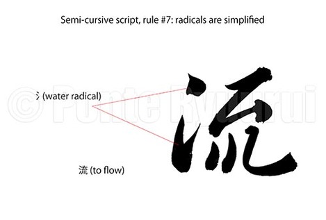 To view other rules of writing Chinese calligraphy in semi-cursive script (行書), click here. Similarly to the rule #7 of writing calligraphy in cursive script (草書), the radical can be simplified in semi-cursive script. The difference is, that the simplification is not as significant as incursive script. There is a delicate border between the semi-cursive script and standard script (楷書) on one side, and cursive script on the other. Cross-over scripts are known as standard-semi-cursive (楷行書), and cursive-semi-cursive (行草書). Depending on the degree of simplification or formal appearance of strokes, semi-cursive script can resemble either of the scripts that it serves as a bridge for. In the above diagram you can see the water radical (氵) written in two brush strokes, and not three as in standard script. The same form can be used in cursive script, though the top dot is usually connected with the bottom part of 氵 by the unbroken line (連綿). 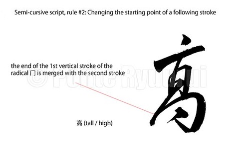 To read more on other rules of writing in semi-cursive script (行書), please see the the full list. Merging two or more strokes into one brush stroke usually alters the appearance of given character. The trick of Chinese calligraphy is to change the structure of a character, without distorting the balance. Radical changes, such as altering of the starting point of a given stroke, will distort the shape of a given kanji radical. In the the above diagram, the character 高, or more precisely 髙, which is a kanji variant (異体字) of 高, has the 冂 (upside-down box radical) disformed by a change in the starting point of a second stroke of that radical. The steep slanting vertical line in the "squashed" radical 冂, corresponds with the top thick vertical line, forming a visual enclosure for the middle part of the character. The kanji seems distorted, but it is balanced. That is a beauty and magic of semi-cursive and cursive (草書) scripts. The entire structure of 髙 is "fastened" with the unbriken line (連綿) technique, which adds additional drama and movement. 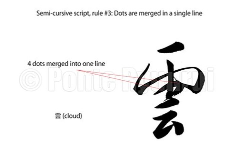 To read more on other rules of writing in semi-cursive script (行書), please see the the full list. Similarly to the third rule of writing Chinese calligraphy in cursive script, in semi-cursive script dots can be merged into a single line, too. Often times dots are connected in a way that even though they are written with a single brush stroke, one can still distinguish how many dots were merged. Naturally, the level of fluency of writing and its suppleness depend on the style of writing. It is important not to mistake a Chinese calligraphy script (書体) with a Chinese calligraphy style (書風). Those are two completely different terms. In the diagram above, I wrote the top part of the character 雲 (cloud), which is ⻗ (rain radical) in a manner closer to the cursive script (草書), whereas the bottom part stays closer to the standard script (楷書). This creates a good balance between a heavy and wide top and a narrow, built out of fewer brush strokes, bottom. The 4 dots of the ⻗ radical are merged into a single line. Watch the video below to see how I write it. |
Categories
All
AuthorPonte Ryuurui (品天龍涙) Archives
August 2020
|

 RSS Feed
