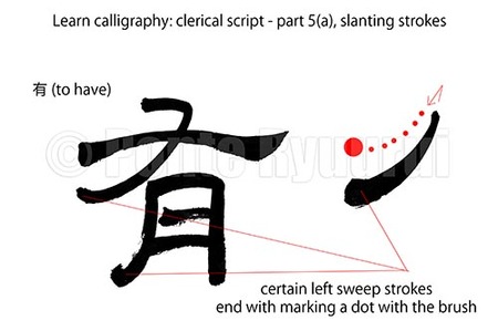
 To view other tutorials on clerical script (隷書) please see here. There are five main types of strokes in each of the Chinese calligraphy scripts. Those are vertical strokes, horizontal strokes, slanting strokes, curved strokes, and dots. Each of those has multiples variants, further multiplied by the calligraphy script types. There are a few variants of slanting strokes on clerical scripts. They can be divided into two major groups, left slanting strokes and right slanting strokes. The pictured (above left) slanting stroke is a left slanting stroke, which means it slants to the left side. The key to understanding strokes in each script is to learn their characteristics and brush operating techniques. In clerical script, each stroke begins with a reverse brush movement (逆筆). However, not all strokes begin in the same manner. In fact, if you watch my other tutorials on clerical script you will notice those nuances. However, the major difference between the strokes lay in the way of leading the brush (送筆, lit. sending the brush), and ending the brush stroke (終筆). In case of this left slanting stroke, the brush pressure against the paper increases gradually, when the brush is on its way towards the end of the stroke, which causes the stroke to thicken. Finally, at the end of the stroke, the brush stops, is twisted (the brush tip marks a circle). During marking a circle, the brush pressure is lessened until the brush leaves the paper surface. See below video to see how it is done in practice. There are no more or less important strokes in Chinese calligraphy. All of them create the balance, build the character structure and even a single dot, which is badly placed or poorly executed, can ruin the whole work.
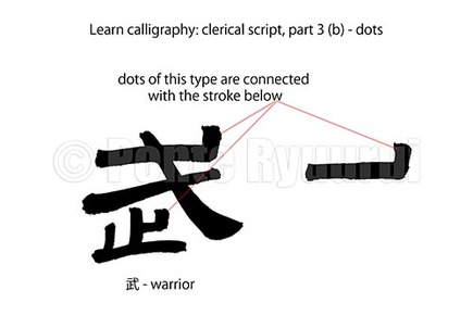 To view the part 3 (a) of this tutorial, as well as other tutorials on Chinese calligraphy scripts, please navigate to the calligraphy tutorials menu. To understand the differences between the clerical script (隷書) and the standard script (楷書) one has to learn about the origins of the scripts of Chinese calligraphy. Clerical script evolved from seal script (篆書), whereas standard script evolved from clerical script. There are many types of dots in clerical script, and they differ in the way of writing (the brush operating method) and, consequently, the shape. The type of dots shown in the diagram above, are remnants of the seal script form of certain strokes or radicals in seal script. The positioning of such dots, and their length or shape may be different, but they remain connected to the main structure of the character. In case of 武 (warrior), the dot in the top right-hand corner (the same that is written as a last stroke of the character - see below movie for details), was originally attached to the top part of the right slanting sweep stroke (written as second stroke in the video). Now, the 戈 in 武 is the pictograph of a long Chinese spear (鉾), and the dot stroke that you see in the clerical and standard script forms of 武 are the pictographic elements of the base of the spear blade.
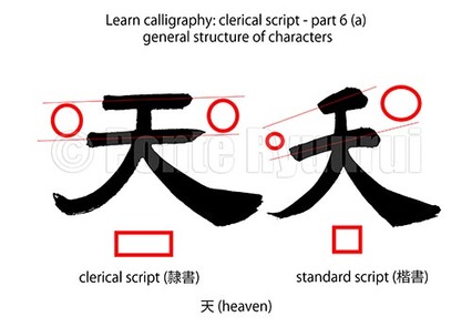 More tutorials on clerical script can be found here. Generally speaking, the structure of Chinese characters in clerical script (隷書) is squat, and horizontally rectangular. However, this rule mainly applies to the mature clerical script (八分隷). The characters in ancient clerical script (古隷) were often oblong, just like the script they evolved from - the seal script (篆書). In addition, the initial oblong structures of characters was imposed by the material they were written on - the long bamboo slips (木簡), although there4 were exceptions. One needs to remember that wooden slips were the most common writing material (aside silk), until the invention of paper around 3rd century B.C.E. The so called Age of Bamboo Slips lasted for some 2000 years. Together with the appearance of the silkworm head and goose tail strokes (蠶頭雁尾) in clerical script, the characters become wider and flatter. If you compare the shape of the character 天 (sky / void) in standard script (楷書) and clerical script (see the picture, above, and the video, below), you will surely notice the substantial structural differences The balancing of the clerical script is also different. Most of the vertical stroke are not only parallel to one another, but also at 90 degrees (or nearly 90 degrees) to the vertical strokes. Most of the greatest masterpieces of Chinese calligraphy were written in mature clerical script, during the Han Dynasty (漢朝, 206 BC – 220 C.E.). For this reason the structure of clerical script is mostly remembered as wide and squat.
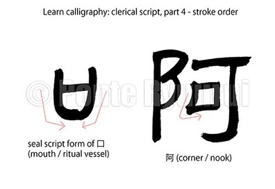 To view my other tutorials on Chinese & Japanese calligraphy please visit the learn calligraphy section. The stroke order in Chinese calligraphy is a very complex issue. It differs from country to country. China, Japan, Taiwan and Korea may use a different stroke order for the same character. For instance, the grass radical 艹 starts with the left-hand side vertical stroke in Chinese calligraphy, but in Japanese calligraphy the stroke order begins with the vertical line. Further, each of the five core calligraphy scripts have or may have different stroke order. If you look on my tutorials on cursive script, you will notice at least two rules out of ten which clearly indicate possibility of altering the stroke order, not only in relation to regular script (楷書), but within the cursive script itself. Clerical script stroke order is somewhere between seal script (篆書), which has very loose and not well defined stroke order to begin with, and the standard script (楷書). Because the clerical script evolved from the seal script, naturally some radicals follow not only the stroke order, but also the shape of the same in seal script. For instance, the stroke order in 口 (mouth / ritual vessel) is based on the way of writing 口 in seal script (see diagram or the video). Some of the older clerical script texts may even contain forms of 口 that look s exactly like the one written in seal script. It is impossible to lay down the stroke order rules in a short article, probably a book would not be able to cover those either. The only way of learning the proper stroke order is via studying the character structures in the ancient masterpieces. Comparing the forms of seal and clerical script of the same character, we can deduce the stroke order. On the other hand, stroke order in clerical script is much more relaxed and not as well defined as the stroke order in regular script. Certain radicals may have more strokes in clerical script that they have in regular script. In the case of 阿 (Japanese meaning: corner / nook), the 阝 (left village radical) radical, it has 3 strokes in clerical script and also 3 in standard script. However, the seal script form of this radical can have as many as 7 strokes.
In my upcoming tutorials on clerical script I will be coming back to the issue of stroke order numerous times. For the sake of a conclusion, I can say that the best way of learning the stroke order and the stroke number of characters, is to start with the standard script first, then semi-cursive, cursive, and finally clerical together with seal script. Stroke order may seem like a trivial issue, but it is the essential knowledge required for being able to write powerful calligraphy. The stroke order dictates the flow, the rhythm, the balance, the structure and, in result, the composition of the whole work. Learn it is as important as learning the brush operating techniques. So, learn it well. 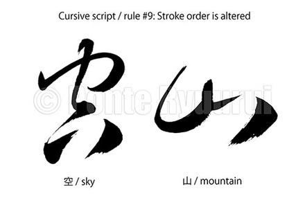 To read more about and watch my other Chinese calligraphy tutorials on cursive script, please click here. The 9th general rule of writing in cursive script (草書) allows us for altering the stroke order of the brush strokes. Stroke order is essential for the balance, structure and composition of Chinese calligraphy (the same goes to Japanese calligraphy). The most rigid stroke order is applied in standard script (楷書). Cursive script's stroke order is maybe not more relaxed, but the rules can be, and usually are, different. This does not mean that writing in cursive script is less restricted than in other scripts. This is a common mistake of basically anyone who begins to learn Chinese calligraphy, and when he or she sees the "simple" forms of the characters in cursive script, erroneously believes that it must be an easy script to execute. This is a very dangerous path to walk, as it will lead you to making, repeating and memorizing your own mistakes, resulting in a weak calligraphy style (書風). To intuitively sense the correct stroke order in cursive script, one has to learn the standard, semi-cursive (行書) and clerical (隷書) scripts first. There are many exceptions of the general rules of writing in cursive script, and they only make sense and are allowed in this script. I plan on making some tutorial videos on this subject as well. In the video (above) I am writing two Chinese characters in cursive script. One is the 山 (mountain), and the second one is 空 (sky / void). In standard script the stroke order of 山 begins with the middle vertical line. In cursive script it CAN begin with the left-hand side vertical line. In the case of the character 空, the first stroke in standard script would be the dot. Again, the flow of the cursive script suggests us to begin writing with the "roof" radical (宀). However, unlike in standard script where the writing of 空 MUST begin with the dot radical (点), in cursive script we have a (limited) freedom of choice. This choice is made during writing, based on the overall composition, flow, form of the character (characters in cursive script may have many forms), etc.
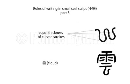 To view part 1 and part 2, please visit learn calligraphy section, regarding the small seal script (小篆). The key brush operating technique applied in writing of the small seal script, is so called "hidden spear" (藏鋒). The spear is a reference to the tip of the brush, and "to hide the spear" means to conceal the brush tip inside the brush stroke (in the centre of the line) during writing. By doing so, it is possible to maintain equal thickness of the line, even while writing curved strokes. Small seal script brush stroke structure and its appearance is more supple than the one of the great seal script (大篆). There are many curves, and most characters have a symmetrical construction. Maintaining the uniform thickness of lines is one of the things to pay attention to during studies. 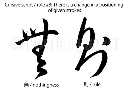 To read about the other rules of writing Chinese calligraphy in cursive script, please see my other tutorials. Writing in cursive script (草書) follows a unique set of rules, and those rules often allow the calligrapher to write Chinese characters in a way, which differs greatly from those that are applied in standard script (but not only). Sometimes, maintaining the flow of writing is more important that following the exact structure of the character. In other words, if the stroke order or even the positioning of a given stroke would cause us to break the energy flow and the rhythm during writing, it is (sometimes) permitted to reposition such strokes, within given Chinese character. This is a very important rule, as it clearly indicates that the composition, the flow of energy (行気), the power of strokes and the logical order of writing in cursive script, can be more important than the structure of the character. Application of this rule requires a wide knowledge of many aspects of writing in cursive script, including the so called unbroken line (連綿体, i.e. the implicit or explicit connection between characters within the calligraphy text). I will write a separate article on the importance of the unbroken line in the Chinese and Japanese calligraphy.
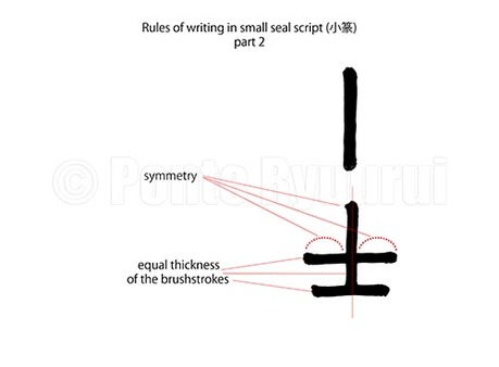 To view the first part of the small seal script (小篆) tutorial, please see this article. Continuing the thought from the part 1, the next important thing to bear in mind is that small seal script was a standardised form of great seal script (大篆). Consequently, the forms of small seal script characters are oblong and symmetrical. Valid feature of this script is also the uniform thickness of the brush strokes, which may vary between characters in the same text, but should not within the same character. It is so, because some character may have many strokes, and some only few. For instance, in the video (below), and the picture (above) you can see the radical 士 (scholar, bachelor, also warrior), but it also is a stand alone character. This character has only three strokes. If you compare it with a complex character, such as 鳳 (phoenix), the thickness of strokes of both in the same calligraphy text written in small seal script will differ. Natural way of balancing those difference is increasing the thickness of the brush strokes in characters that have fewer strokes. In case of small seal script, however, it is not as obvious as in other scripts of Chinese calligraphy. In part 3 of small seal script tutorial I will be explaining the techiniqe of writing curved lines, and how to position the brush tip during writing.
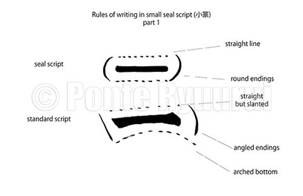 Small seal script (小篆) is a member of large script family, known as seal script (篆書). The latter splits into great seal script (大篆), and small seal script. Seal script family of scripts is the most ancient one in the history of Chinese calligraphy scripts. Small seal script is the youngest of them all. Nevertheless, the writing rules of the small seal script are among the most strict ones in Chinese calligraphy. Small seal script requires great precision in operating of the brush tip, very steady hand (especially when written with the suspended art technique). The part one of the series on small seal script's rules of writing, focuses on a few basic rules. First, all and any strokes in the small seal script ought to be written slowly. Secondly, the brush needs to stay at a 90 degrees angle to the paper surface at all times. Lastly, the horizontal strokes should not slant, like they do in standard script (楷書), to give only one example. Watch the below video for more details. Writing in small seal script is a true form of meditation. Only when the mind is calm, the brush will be steady. Through its diligent studies, one can truly appreciate the ancient art of Chinese calligraphy.
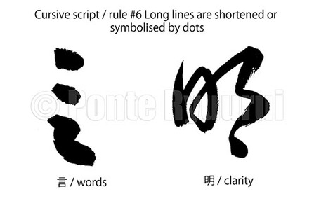 The next rule of the Chinese calligraphy in cursive script (although all the rule also apply to Japanese calligraphy) is that long lines are shortened or symbolised by dots. This rule can be extended to short lines as well (I included the examples of both instances in the movie and the picture). As you can see on the photograph (left) the character 明 (bright / clear) is built out of two radicals. Radicals are kanji (漢字, lit. character of Han China, i.e. Chinese characters) compounds, i.e. smaller units that given character's construction is based on, though it is vital to remember that certain radicals can act as stand alone characters. In the case of 明, the radicals are 日 (sun) and 月 (moon), which can act as independent characters. The line that is reduced to a dot is the left-hand side line of 月, which is also the first stroke of this character. In the case of 言 (word), the top short line becomes a dot, and three remaining lines are reduced to one dot. This merges two rules of writing Chinese calligraphy in cursive script in one character, which is very common for this particular calligraphy script. The first rule applied here is that the total number of strokes is reduced, and the second is that the line is degraded to a dot stroke. As you can see from this example, the rules of writing Chinese or Japanese calligraphy in cursive script are used with great flexibility. Maintaining the balance between the simplification of the form of a character, its structure, power and vigour of strokes, and the flow of energy (行気) in the whole calligraphy work, is the key to well executed handwriting, regardless whether it is Chinese or Japanese calligraphy.
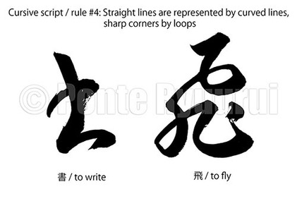 This is the fourth general rule of writing in cursive hand. To read more about other rules, please visit the learning section of this website, which contains more cursive script tutorials. Cursive script (草書) ought to flow. Consequently, corners and and straight lines (although not all of them) are often represented by curved lines and loos, various bent lines, arches and so on. It is not a technique that can be applied freely and randomly to any character and any stroke, as one pleases. There are rules that need to be followed, but those rules are rather difficult to explain in words. They are more of an intuitive nature, which sense is built gradually through studies of classical literature written in other four scripts of Chinese calligraphy. This is why only diligent studies of mainly standard and clerical, but also semi-cursive scripts are essential to understanding and proper execution of cursive script. View the video (below) to visually see how this rule is applied in writing in cursive script. 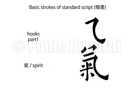 To read more on standard script and vew other of my tutorials, please click here . There are many types of hooks in standard script (楷書), and they all have slightly different rules of writing. I will try to slowly cover them all, one by one. This particular hook is not an easy stroke to execute. It is complex and requires operating the brush at multiple angles. It starts with a slanting upwards vertical stroke. Then the brush is to be lifted (without loosing the contact with the paper surface). Next, the angle of writing is changed, the brush pressed down and proceeds to writing the curved line. This curved line varies in thickness, which effect is achieved by controlling the brush pressure. At the end of the curved line, the brush stops, angle is changed. The last movement is the sweep, which should be written very slowly. Below is a video with visual explanation. To see my other tutorials see the learning menu. 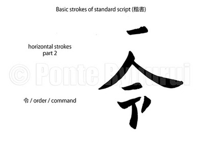 To read about other types of strokes in standard script, please click here. This type of horizontal stroke is slightly slanted upwards. Both ends should be parallel to each other. The stroke thickens towards the end. The key here is the brush operating technique (see the video for details) All strokes in standard script (楷書) should be written slowly and with care. Similarly to small seal script (篆書), even a small disproportion or distortion of balance will be immediately visible. In China standard script is often practiced on a gridded paper, for better understanding the proportions and angles of strokes, and their relations. 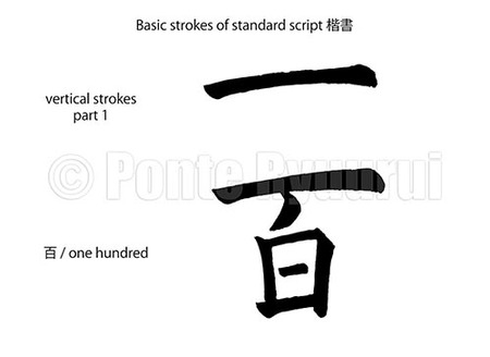 I will cover the history of the standard script (楷書) in a separate article, but for the sake of placing it on the timeline of the history of Chinese calligraphy, let me just say that its origins go back to 170 B.C, which fact was confirmed in 1972, when the unearthed bamboo slips in Hunan province (湖南) were covered in a script that displayed evident features of modern standard script. Standard script is one of the most demanding scripts in Chinese calligraphy, and also most likely the first one a new calligraphy student is about to study. There are 8 core strokes in standard script, and they are known as the 永字八法 (8 laws of the character 永). Each of those strokes has many variations. The details of the 永字八法 will be also covered in a separate article. There are many different approaches to standard script, and there are numerous classics written in various styles. Also, it is important to state that the Chinese calligraphy aesthetics and Japanese calligraphy esthetics differ. Consequently, although the rules of writing remain similar (or the same) the appearance of both may differ. Consequently, although the rules of writing remain similar (or the same) the appearance of both may vary. There are many different approaches to standard script, and there are numerous classics written in various styles. Alhough I study calligraphy in Japan, my teacher as well as the calligraphy organisations I belong to, put a very strong emphasis on Chinese classics. Therefore, my style is a blend of both types of calligraphy. Nevertheless, I decided to base my tutorials on the masterpieces of Ouyang Xun (歐陽詢, 557–641 C.E.), a brilliant Tang dynasty calligrapher, whose standard script was unmatched (although he was not the only genius of standard script in the history of China). His style may sometimes seem to be slightly over the top and "too elaborated", but the balance, character structure, and the surgical precision of strokes are simply mind blowing.
I remember I told my teacher once that I do not like a particular style of calligraphy (it was a Northern Wei standard script). He replied: "Studying only what you like is like taking a shortcut. Calligraphy is a journey. Those who are clever live by achieving an aim, and take the shortcut. Those who are wise, explore beyond their sight and become enlightened. " While studying standard script remember to: 1. write s l o w l y 2. learn the basic strokes 4. one stroke = one story 3. study different styles of standard script (do NOT copy me, copy the masterpieces) 4. never ever stop studying it, as standard script is the foundation of your skill with the brush 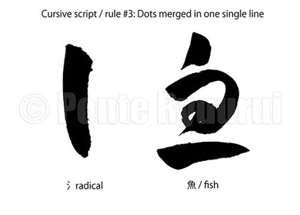 The third out of ten general rules of writing in cursive script (草書) . Radicals (radicals are components of Chinese characters) represented by dots in standard script (楷書), can be replaced with a single line. There are several types of radicals represented by dots. Radicals that contain two or more dots can be represented by a single line in cursive script. The diagram (left) and the movie (below) show only one type of such stroke in cursive script. There are many styles in calligraphy and also any of the radicals which are composed of dots can be written in a slightly different way. Being able to write the same character or the same type of radical n Chinese or Japanese calligraphy is a proof of mastery of this art, and shows a great knowledge and experience of the calligrapher. It also has a great impact on the appearance and aesthetical value of given masterpiece. It is important to realise that it is not the only one out there. Careful and diligent studies of cursive script are the key to learning and understanding other variants of this stroke. 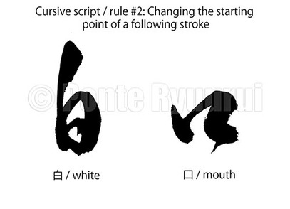 The second rule of writing in cursive script (草書) (second of of ten in total; to read more about cursive script and the rules in general see my article here) is that some strokes can begin in the position where the previous stroke ended. This is quite a vital rule and goes along with all 10 rules of writing in cursive script. Those rules not only define the appearance and dynamics of the cursive script itself, but also influence the overall composition and mood. There is a technique known in Japanese as "unbroken line" (連綿体, lit. unbroken script). This technique applies to Chinese and Japanese calligraphy on many levels and I will discuss it in greater details in a separate article, however, the basic idea is to write calligraphy in a way to create an illusion or continuity, or actually merge all characters (or some) in one long brush stroke (where the brush does not leave the surface). As you can see in the diagram (above) and the video, the cursive script is all about the flow, but a flow that follows strict calligraphy rules (other than 10 general rules of writing cursive script). Those rules can be only mastered via studying and copying of ancient classical Chinese (or Japanese, in case of Japanese calligraphy) literature.
 Cursive script (草書) evolved from the clerical script during the Han dynasty (漢朝, 206 B.C.E. - 220 C.E.). The embryo of cursive script is known in the calligraphy world as “draft script” (章草) which literally means “a draft (governed by) rules”. The use of character 章 (draft) is not accidental, however, and it is related to a name of the Emperor Zhang of Han (漢章帝, 57 - 88 C.E.), who introduced many governmental reforms, which required maintaining a close contact with all of the officials throughout his territory. He was the first ruler whom local officials could contact via letters written in cursive clerical script, i.e. “draft script”. It may seem not much of a change, but if we compare this to modern times, it would be similar to a situation when a city governor is contacting a president or a prime minister, by texting them from his iPhone. At that stage, draft script still bore visible elements of clerical script, yet was much smoother and curvier. Eventually, “draft script” developed into what we know today as cursive script. In the West, cursive script is often referred to as grass script, which is incorrect. Although the character 草 means "grass", its other meaning is "draft". Cursive script is one of the most difficult scripts to master. It is difficult to read, and difficult to write. A tiny movement of the brush tip in a wrong direction, can result in writing a different character from whichever was intended. Many people see this script as "easy", and attempt to write it without solid foundations in standard script (楷書) or semi-cursive script (草書), but I can tell you that it will only cause repeating and learning one's own mistakes. I will write on cursive script much more in the near future.
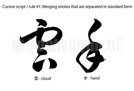
There are 10 major rules applying to cursive script: 1. Merging strokes that are separated in standard form 2. Changing the starting point of a following stroke 3. Dots merged in one single line 4. Straight lines are represented by curved lines, sharp corners by loops 5. Reduction of total number of strokes 6. Long lines are shortened or symbolised by dots 7. Complex radicals are significantly simplified 8. There is a change in a positioning of given stroke 9. Stroke order is altered 10. Starting point of an initial stroke is changed The diagram and video *above" explain the rule # 1.  Dots may be the smallest of the strokes in any script, but they are not necessarily the easiest to write. There are many rules to writing dots, and those depend on the script. In the case of clerical script, each dot should be (preferably) different from one another. The trouble is, that the writing technique remains the same (although there are several types of dots in clerical script, which will be covered by upcoming tutorials). What changes is the way we shape them with the brush. First of all, each dot begins with the reverse brush movement, which rule also applies to ANY stroke in clerical script. This technique is know as "reverse brush" (逆筆). Secondly, the dots should be written fairly slowly, in one stroke, and in a way to match the style of clerical script that we write (see my previous article to read more about types of clerical script). The three dots you see in the diagram (above) are a water radical, called sanzui in Japanese (氵), which means "three waters". This radical will reappear in my next tutorials, so you will be able to see other ways of writing it (including other scripts as well). Watch the video (above) to see how to operate the brush during writing of this type of dots in clerical script. Dots such as those in character 武 (the art of war / martial arts) or 龍 (dragon) will be written in a different way. See my upcoming tutorials to see how it is done.
There are many various types of vertical strokes in clerical script (隷書). The general rule of thumb is thus: every stroke begins with a reverse brush movement (see below video). However, the ways of writing the mid-sections and endings of the strokes may differ. Some have equal thickness and end with lifting the brush swiftly, whereas others may increase in thickness towards the end of the stroke (such as the one in the video below). Also, certain strokes can end with stopping and pressing, or even rotating of the brush tip. I will cover all types of vertical strokes of the clerical script in upcoming tutorials. To see other tutorials on calligraphy please see the learning category on this blog.
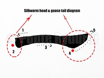 Clerical script (隷書) evolved from the great seal script (大篆). Its origins are dated back to the Warring States period (戰國時代, 475 – 221 B.C.E.) in China. There are two major types of clerical script. One is called ancient clerical (古隷), and the other is called mature clerical script (八分隷). The difference between those two, aside the various time periods throughout which they were used, is in writing technique, and , consequently, the appearance of both types of the clerical script. The technique shown in the picture (above) and the video (below) is applied in mature clerical script, however, it was initiated earlier on, and utilised for wring on long wooden slips (木簡). The name of this technique, the silkworm head and the goose tail (蠶頭雁尾), comes from the shape that those stroke resemble. Both techniques have many variants, and here you can see only one of them (the differences are in the appearance of both strokes, depending on the time period in calligraphy history, or the calligraphy style used for writing in the clerical script). Nevertheless, the technique of writing is always the same. In the above diagram you will notice numbers 1 - 5. They indicate the order of writing. Every stroke in clerical script begins with a reverse movement of the brush regardless of the direction of the stroke. This technique is known in Japanese calligraphy as gyakuhitsu (逆筆, lit. reverse brush),. One needs to crouch to make the leap graceful, as they say. This introduces a rhythm of writing which also slows down the brush in the process. The red dots (diagram) indicate where the brush should be stopped, briefly. All 5 movements ought to be completed in a single brush stroke (i.e. without lifting the brush tip off of the paper surface).
It is said, that mastering of this technique means that one has learned the basics of clerical script. It does not mean, however, that one has mastered the script itself. That comes with years and years of diligent practice. 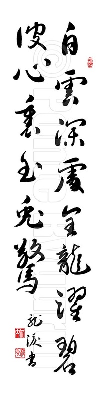 Chinese or Japanese calligraphy art is all about immersion. One has to dissipate into one's element through studies. If you think of the studies as a commitment, your consciousness will disrupt the natural flow and obscure the true purpose. Writing calligraphy is not about focus or executing a premeditated design or a pattern. The aim of endless hours with the brush is to make you lose yourself in the studies. Do not remember, but forget instead. When you think what to write, it is your arm or mind that writes. When you stop thinking, then the Universe writes for you. To write smoothly, one has to become like water. It flows naturally, it is desire-free, and goes to where the geography of the land leads it to. The same with writing Chinese calligraphy. If the mind is knowledgeable, and the spirit pure and strong, the brush will glide like a dragon on the vast skies. The years of training is the geography of your art. Smoothen it with your studies, but do not forget about the beauty of mountains. When your spirit meets them, it will curve graciously. Your pure mind and clear soul is the water. Do not pollute it, do not regulate it. Let it remain like a child. Writing calligraphy could be compared to a strong feeling,. You are not supposed to control it. Let the emotions out. When you master the rules, and then forget them, it is when the journey begins. Stroll with your head upright, but do not be conceited. Chinese calligraphy is created in the absence of pride. Do not look back either, you are not going that way. My teacher once said: "I cannot write the way I was writing last year, and I do not know what my writing will be like next year. I do not focus on either. I do not wish to know what the spring will be like. I enjoy the winter, and welcome the change in weather with anticipation. This is what makes my life worth living for. Instead of wasting the energy on predicting, it is better to cherish what we have and learn how to adjust. This is the true way of living through writing. " Calligraphy teex: 白雲深處金龍躍 碧波心裏玉兎驚 Glittering sun was ascending like a golden dragon amongst the deep white clouds. Reflection of the astonished jade moon was sinking deep beneath the blue ocean waves It is a Zen phrase with multiple possible interpretations. Many thanks to Yuki Mori for finding this phrase, and her help with interpretation.
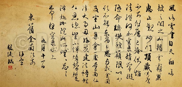 Kūkai (空海, 774 - 835) is one of the most celebrated calligraphy Masters of ancient Japan. He was a Buddhist monk known as Kōbō-Daishi (弘法大師, i.e. The Grand Master Who Propagated the Buddhist Teaching). He was also a skilled poet, artist, and engineer. He was also the founder of Shingon Esoteric sect of Buddhism. It is also Kūkai who is said to be the creator of Japanese kana syllabary, which is one of the writing systems used in Japan until the present day (aside kanji), although it was never clearly confirmed by the historians and researchers. According to legends, Kūkai composed the famous Iroha poem, which is still in use for educational purposes in Japanese schools. Iroha contains all hiragana characters, but none of them is repeated. Its text reads: Although its scent still lingers on the form of a flower has scattered away For whom will the glory of this world remain unchanged? Arriving today at the yonder side of the deep mountains of evanescent existence We shall never allow ourselves to drift away intoxicated, in the world of shallow dreams. (translation by Professor Professor Ryuichi Abe) 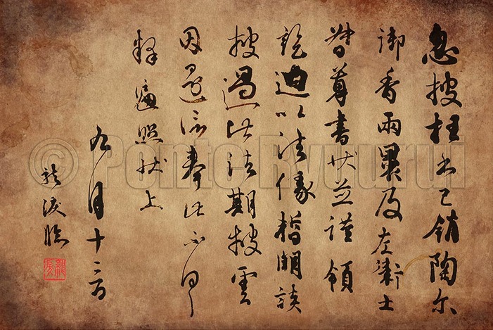 Kūkai was travelling to China and spent there 20 years of his life. His knowledge and skill in Chinese calligraphy was outstanding. His writing style (書風) was heavily influenced by the masterpieces of Wang Xizhi (王羲之, 303–361), the calligraphy sage. He brought back with him many Chinese classics upon his return to Japan in 806 C.E. Kūkai, together with Emperor Saga (嵯峨天皇, 786–842) and Tachibana no Hayanari (橘逸勢 c. 782-842) was one of the initiators of the Japanese style in calligraphy, referred to as wayō shodoō (和様書道). Those three gentlemen are know today as "three brushes" (三筆) of the Heiyan period (平安時代, 794 - 1185). The above two calligraphy works are my humble coipies of the famous "Letter carried by the wind" (風信帖), which was a series of letters written to another Buddhist monk, Saichō (最澄, 767 - 822), the founder of Tendai (天台宗) Japanese school of Mahayana Buddhism. "Letter carried by the wind" is a national Japanese treasure, and it is often used for calligraphy studies in Japan. It style is a brilliant blend of Chinese and Japanese calligraphy styles, of which analysis can only enrich one's skills and horizons. See the Chinese and Japanese calligraphy history section to read more. 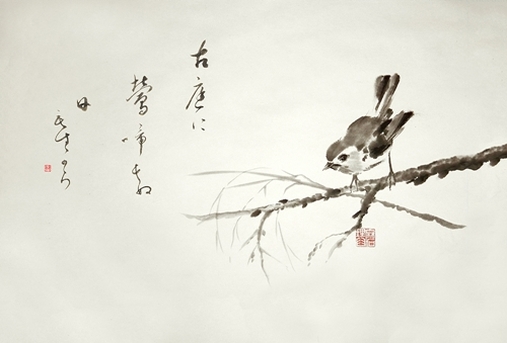 Ink Treasures is an artistic project that I am currently working on together with an accomplished ink painter, Mariusz Szmerdt.
We decided to combine our efforts, and not only co-create a series of artwork that would merge the traditional and modern ink painting and calligraphy art., but also tell you more about the history and secrets of both, and share some of our knowledge with those who are willing to study them. Our goal is not a specific genre, but a wide spectrum of themes, subjects, and techniques. The aim is to inject some new life into the traditional arts of ink painting and calligraphy. Our works will span from martial art motifs through female acts, abstract or fantasy art (you may expect a lot of dragons), to very traditional and subtle creations, such as you can see in the above picture., or even philosophical themes, such as Buddhism, Zen or Taoism. We will be opening a store with out art, too., which will be for purchase in various formats, be it electronic, raw (prepped for framing), or framed (modern or traditional, including Japanese hanging scrolls). We also except orders for commercial use, such as advertisement, books, posters, stock photos, business cards, concept art, etc. Please visit us on www.ink-treasures.com / facebook Ink-Treasures / Google+ Ink Treasures Our contact: info@ink-treasures.com / szmerdt@ink-treasures.com / ryuurui@ink-treasures.com You can also mail me directly at ponte@ryuurui.com I am often asked by people who wish to study calligraphy, where and how they can learn. I may tell you right now, that there is no book in the world that can replace a good teacher. So, if you think you can study calligraphy from anything titled "Three easy steps to mastering Chinese / Japanese calligraphy", then you are very much mistaken. One day I was editing a video of my teacher writing a short phrase in seal script (篆書), and I suddenly realised how similar is the way that we both hold the brush. But not only that, even specific gestures, like repositioning of the brush in the hand, or subconscious "brush doodling" in the air, too. Then, I watched his arm, its position, the angle of the albow against the paper, brush grip, etc. I was astonished to see obvious similarities. Then again, our writing styles (書風, i.e. one's personal handriting style) differ. So, the technique is virtually the same, yet the outcome is not. Years ago, when I have only started to study caligraphy, I showed him one of my works. It was basically a copy of his own work. I thought he will be pleased, but he shaking his head in disapproval instead. He looked at me, seeing that I do not understand why he is not happy about it, and said: "Copying ancient masterpieces is a path to enlightenment. Copying your teachers' style is the end of the road. By copying my style you insult my teaching methods. Watch the technique, learn the basics, study the line, and then let your heart guide you. I can help you to build a boat, but you have to learn how to sail and maintain it yourself. Go and discover new lands, do not stick to the harbour". I have visited tens of calligraphy exhibitions in past years. Having the words of my teacher in my mind, I was shocked to see how many people copy their own teachers. The situation is serious to the extent that works displayed during some exhibitions are so similar, they all seem to be written by the same person. This is usually done to either tickle the teacher's ego, or simply get a praise, or even worse, to win a prize. Very sad indeed.
The technique is everything. Calligraphy is like martial arts. You study for a lifetime only to forget what you have learned. Let me tell you this again, you study for a lifetime only to forget what you have learned. You ought to write the calligraphy with your soul. There is no ink, no brush, no paper, no nothing. There is only Matrix. Then, and only then, you can call it shodō (書道; Japanese for "calligraphy", whcih could be interpreted as "the way of life through writing). Practice is not about perfection, but about freedom. If you move before you thought you needed to, then you are trully free. The calligraphy in the movie (above) is a quote of a famous philosopher, Albert Shweitzer. It reads: "Success is not the key to happiness. Happiness is the key to success. If you love what you are doing, you will be successful." 日本語: 成功は幸福の鍵ではない。幸福が成功の鍵なのだ。自分のやっていることが好きなら、きっと成功するだろう You can also see me writing this text with a ballpen, here. There is something about quotes that people like. Perhaps it is their amazing power of defining and summarising our paths, our goals, things we like and do not like, and so on. Those quotes assist us in expressing thoughts or wishes that, sometimes, we have troubles with compressing them into a smaller package, vocabularistically speaking. This new project of mine aims at gathering quotations and sayings of people from any ethnic, cultural, or historical environment, and putting their words on paper by means of Chinese or Japanese characters. The power of Far Eastern calligraphy resides in the complexity of the message of the brush strokes (or even pen / ballpen strokes, as you can see in this particual movie, below). Kanji or hanzi (or other writing systems, such as Japanese kana) can convey the emotions of the writer very well. The line flows down fromthe top of the page to the bottom like water. It can be a violent mouintain creek with many rapid curves and strokes, or a gently meandring stream thorugh a wide valley. It can be a roaring waterfall crushing anything in its path, or a still lake embracing the warm rays of lazy sun, setting down.
The script can be refined like mature clerical script (八分隷) or small seal script (小篆), where stokes are premeditated and they seem to be designed. It can be wild like cursive script (草書), or uneasy and illusively careless like ancient clerical script (古隷), to give only a few examples. Then, each of those has its variations. The ink is the limit. The quote in this movie is by Albert Schweitzer, an extremely talented man, who was a German theologian, pholosopher, physician, and a musician. It reads: "Success is not the key to happiness. Happiness is the key to success. If you love what you are doing, you will be successful." Albert Schweitzer Japanese translation: 成功は幸福の鍵ではない。幸福が成功の鍵なのだ。自分のやっていることが好きなら、きっと成功するだろう。 My path to happiness is marked by ink and brush. The day I had realised it, I was born again. I wish you will find yours. |
Categories
All
AuthorPonte Ryuurui (品天龍涙) Archives
August 2020
|
 RSS Feed
