|
Today I was designing a cover for one of the books that I will be publishing this year. Yes, it will be quite a year. This is not the final design yet, and it can be changed, so I am posting it here to hear your feedback. Feel free to comment below or drop me a line at ponte@ryuurui.com To read more about this publication, please see a separate article on the subject. 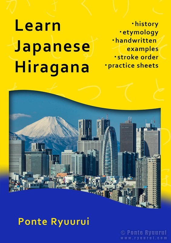
Some of you probably know that I am working on several book projects. Today I decided to add one more, or actually two more. Last year I created a free tutorial on the origins of hiragana and katakana, but it is split into 96 separate articles, and all of the material is online. So, I decided to put together two small exercise books, one for hiragana and one for katakana. Books will include additional information, such as the history of both kana syllabaries, and a short dictionary that will explain all the difficult terms, etc. Below is a sample page from the hiragana book. It is still just a draft, but I wanted to hear your opinions. Perhaps I could improve it. Those books are aimed at those who wish to learn how to write Japanese kana's. Every single Chinese character in those books is hand written by me, and each script is based on historical forms of a given kanji. The same goes to the kana syllabograms. Books will be in A4 format, available in hard form and as a pdf download. 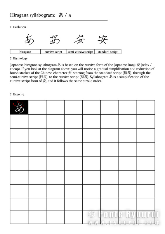 Edit: here is an updated version of the same page, which I created after receiving valuable feedback from you guys. I really appreciate it! 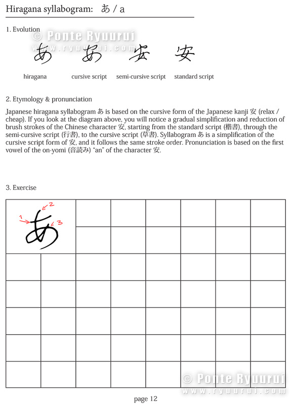  First of all, I would like to thank all who visit my site, and say that I greatly appreciate all the positive feedback and support that I am receiving, whether it is in in regards to my art and learning materials on the Japanese and Chinese calligraphy, or the artistic projects that I am developing. As you can see, I have completely overhauled the Ryuurui's Art Studio website, and gave it a new look and feel. I did that for a few reasons. One was that I have created so many calligraphy and photography art for past few years, that it was simply too much to post it all, and too confusing for you to navigate through. So, I removed all the galleries and created a portfolio tab instead, which shows the scope of the art that I create. All the artwork that was in my art gallery is not gone from the internet forever. I will be republishing my art in the blog section, with educational articles and interesting information for all of you who wish to learn more not only about Japanese and Chinese calligraphy, but also the art photography. In regards to the learning tab of this website, I will keep all the information as it is, but I will reorganise it in a way to accommodate some room for photography tutorials and tips. It is highly possible I will also start sharing some information regarding photography post processing, software and so on, especiall;y that I am venturing now into the HDR photography, photoshop art, composite photography, and so on. In addition, my art will also focus on merging the ancient world of Japanese and Chinese calligraphy with the digital photography and digital art. Naturally, I am still involved in studying classical calligraphy and research, calligraphy exhibitions in Japan, etc., so there is no change in this area, it simply gets expanded.
I had some questions regarding my publications. My book on etymology of Chinese characters and Japanese kanji is complete (volume 1), and my Japanese literary agent is in the process of suggesting the book for publishing houses in Japan. My poetry book should be published this year, I have the entire text ready, I am now deciding on which calligraphy art I should add to it. In regards to my calligraphy book - this will have to wait, for two reasons. One is that I have two calligraphy books written. The first one is more philosophical and the other one is more factual and history related. I am considering combining them both into one volume, and at the moment I simply do not have the time to do this. I plan on finishing it after I am done with publishing the poetry tome. In regards to other projects of mine. The Japan in photography now has a new blog. It will be a daily photo blog with pictures of my travels around Japan, and short articles with interesting facts regarding Japanese culture, traditions, interesting places, events, and so on. Majority of those photos can be purchased in a form of fine art prints at my store on Fine Art America. I have large plans for Japan in photography in motion, but it is still in early stages, so I will share more when it is all ready to go. The digital art store area will also be expanded. Ryuurui Foto Studio is a site exclusively for my work as a commercial photographer in Japan, which purpose will probably remain unchanged.  Last but not least, the Ink Treasures project, which we have started last year with the ink painter Mariusz Szmerdt. The project was on hold for a while, but we are already discussing its future, including rebuilding the site to give it a new look and more focus on the artwork.
This will be a very busy year for me, but since it is The Year of the Horse, I think it should be. If anyone has any suggestions, ideas or wishes to share his or her thoughts in regards to any of my projects, please feel free to leave you comment below, or contact me at ponte@ryuurui.com. 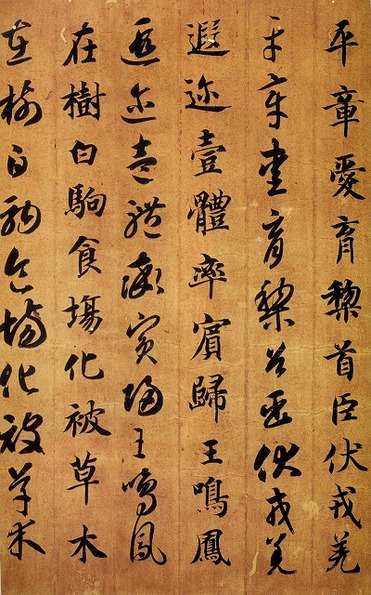 Thousand Character Classic (千字文, Qiānzìwén) is one of the most important classics in Chinese literature, as well as a profound source of Chinese calligraphy masterpieces. It is said to be composed by Zhou Xingsi (周興嗣) during the first half of the 6th century C.E., upon the order of the Emperor Wu of Liang (梁武帝, 464–549), the founder of the Liang Dynasty.
Emperor Wu was known to be well educated and enlightened ruler, who was promoting university level education, and, being a devout Buddhist, who opposed the animal sacrifices. It was Emperor Wu, who selected 1000 characters from works of the famous Wang Xizhi (王羲之, 303–361), hence the original name of the text (次韻王羲之書千字), which he suggested to his princes to be used for practicing calligraphy, and he asked Zhou Xingsi to compose a poetic essay out of them. The legend says that this task strained him so much, that Xingsi's hair turned completely white after completing it. The Thousand Character Classis consists of exactly 1000 Chinese characters, and what is more, none of those characters is appearing more than once in the entire text. The text itself is a poetic journey through the history of China, it contains information on geography, astronomy, ethics, politics, and so on. Thousand Character Classic was and still is used to teach kids Chinese characters. For calligraphers, this text is an invaluable source of knowledge, especially that so many great calligraphers copied it in their own style. What is more, the text usually was written in two or more scripts, which serves as a great reference for studying those. Placed side by side, Chinese characters in standard, semi-cursive, cursive, clerical or seal script, are a great way of familiarising with their various forms, as well as the ways of proper writing by the means of a calligraphy brush. The above picture is a fragment of Thousand Character Classic by Zhi Yong (智永, birth and death dates unclear), the great calligrapher and theoretician of the Sui Dynasty (581–618). Zhi Yong was also the author of the 永字八法 theory, i.e. "the eight principles of the character 永 (eternity)". This classic is known as 真草千字文, as it comes in standard (真) and cursive (草) scripts. Yong's handwriting style is bold and powerful, and his standard script often crosses the border with semi-cursive (行書). For those of you who wish to study contents of the Thousand Character Classic, there is an English translation created by the Nathan Sturman, of the University of Cambridge.  Unlike Chinese calligraphy, Japanese calligraphy utilises several different writing systems. Those are: kanji (漢字), katakana (片仮名), and hiragana (平仮名) the writing systems known to anyone who studies modern Japanese language, but also hentaigana (変体仮名), manyōgana (万葉仮名), and so on.
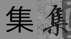
To understand the history of Japanese calligraphy, it is best if you read my article on the subject. However, for the sake of better understanding of this article, it is necessary to say a few more words in regards to those writing systems. Japanese kanji evolved from Chinese characters. Since Japanese grammar is completely different from the Chinese one, there was a need for developing a writing system to be used for distinguishing prefixes, grammatical expressions, etc. Today, hiragana syllabary is used for dealing with grammatical issues, and katakana is mostly used for writing foreign names and as phonetic explanatory notes. Historically speaking, various different types of Japanese calligraphy have evolved, depending on which writing system, or writing systems, are applied in a single calligraphy work. For instance, the calligraphy you see in the picture (above), is a typical kana majiri bun (仮名交じり文), which stands for: "a text that is a mixture of kana and kanji". Another type would be chōwatai (調和体), which stands for "harmony of scripts". Such calligraphy can include both kana syllabaries and kanji, similarly to kana majiri bun, but the forms of characters or syllabopgrams are based on those found in classical literature. In this respect kana majiri bun is a modern form of chōwatai. Last but not least, there is also kana script (かな), which refers to calligraphy written exclusively in hiragana and / or hentaigana. Pictured calligraphy: 果てしない夏(の)愛 (everlasting summer love) In modern times we all study from printed books or data published on the internet. There is no such things as handwritten books, and the only time we are in touch with handwritten form of any language is mostly through our own writing. When learning kanji (i.e. Chinese characters) we refer to shapes of characters printed in books or dictionaries. Our brain registers those shapes, and that is how we right those character by hand. In China or Japan, kids learn how to properly write characters with a brush, which is an obligatory subject. Now, one of the reasons, of such classes still existing, is that people learn much faster through hands-eyes coordinated actions. The other reason is much more practical. Many Chinese characters or Japanese kanji have very different appearance in a handwritten form. Certain radicals (i.e. parts from which kanji are constructed) can have multiple forms. For example, 心 (heart, mind, spirit, etc.), can be written as 心, 忄, or 㣺. All those forms are derived from the ancient divinatory script (甲骨文) and bronze texts (金文) of the Shang and Zhou dynasties (from ca. 6th century B.C.E. onwards), as well as the later clerical script (隷書). Other radicals can appear in a simplified form, to allow for easier reading. If you look at the images below, I picked three random characters from the famous "Preface to the Poems Collected from the Orchid Pavilion" (蘭亭集序) by Wang Xizhi (王羲之, 303–361). This masterpiece is written in semi-cursive script (行書), which is the script most of the people would choose for casual writing.
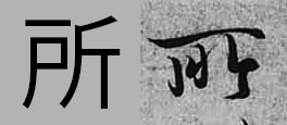
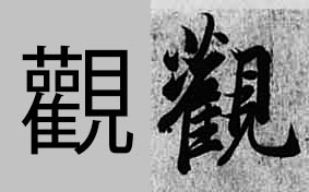
Looking from the left to right we have 集 (to gather), 所 (place) and 観 in its traditional form of 觀 (appearance). The bottom radical 木 (tree) written at the bottom of a character will (in most cases) be a combination of 十 with two dots on both sides. This way of writing is more aesthetically appealing, and the whole structure looks much lighter in form, which improves the overall composition of given kanji.
If you look at the second character (所) it looks very differnt from its computer version. This particular form was derived from the later clerical script (隷書) forms of 所, particularly the top long horizontal stroke. The third character's top-left part is known as the ”grass crown" radical, which also has many versions (艸,艹,艹,艹). It is almost never written the way you see it in the computer font. It would simply be too heavy and unsophisticated. Then the two 口 (mouth) radicals are simplified to dots, which is common in semi-cursive writing. There are thousands and thousands of characters that look differently in a written form, and the only way to master those forms is through copying or viewing the ancient masterpieces, as well as the analysis of different calligraphy script. 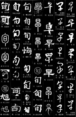 Chinese writing is the oldest writing system on our planet. It precedes Sumerian cuneiform by at least some 1500 years, going all the way back to the Yangshao culture (仰韶文化; 5000 – 2000 B.C.E.). It is also the most advanced writing system that human race managed to develop. We know for a fact that the total number of Chinese characters exceeds 90,000. If one compares this against the 23 letters of the Latin alphabet, it makes one wonder how such overwhelming number of character is organised. Ancient forms of Chinese characters are often mistaken for pictographs, hieroglyphs, and in extreme cases, letters. It is so, because our Western minds see differently than a Chinese or Japanese person. It also has to do with the nature of art and differences in aesthetics between the West and the East. In great simplification, Far Eastern art underwent a transformation from very abstract and symbolic to one infused with more realism. The art of the Western side of the world went through the exact opposite process; from realism to abstractionism. Consequently, a Chinese person looking at calligraphy work of the character 海 (sea) will sense the power of water, anger of waves, or suppleness of the water, its life giving ability, or element of clarity and spiritual purity. Westerner will see waves, water droplets, and sea foam. He or she will most likely seek a shape of something they can relate to in real life. Hieroglyph is from Greek, and it means “sacred writing”. Hieroglyphs differ from pictographs. One could say that they are onomatopoeic pictographs, i.e. characters that depict a given shape of an object and bear the same sound as that object. For instance a hieroglyph for a bird will resemble the shape of a bird and will have the sound “tweet”, etc. A pictograph is a character that is a physical representation of the shape of whatever it stands for. So a character for horse will resemble the shape or characteristic features of a horse. Chinese characters are divided into 6 groups. Those are: 1. Characters of pictographic origin (象形文字) 2. Phono-semantic characters (形声文字) 3. Compound ideographs (会意文字) 4. Rebus (phonetic loan) characters (仮借文字) 5. Indicative ideographs (指事文字) 6. Reciprocal meaning characters (転注文字) In Japan there is also one more category, known as National Characters (国字), i.e. characters artificially created from two or more characters or radicals. The above 6 groups are known as Liùshū (六書), i.e. “Six methods (of forming Chinese characters)”. The first book that mentioned this theory was the Confucian classic, the Book of Rites (周禮), also known as Rites of Zhou, from the 2nd century B.C.E. However, the first true analysis of this theory appears in the famous book by a Han dynasty philologist, Xǔ Shèn (許慎, ca. 58 CE – ca. 147), entitled “Explaining Simple (Characters) and Analysing Compound Characters” (說文解字), written some 4 centuries later. By far, the largest group of Chinese characters are the phono-semantic characters. 85% – 90% of Chinese characters belong to this group. That includes a vast majority of the most ancient Chinese calligraphy scripts, such as bronze inscriptions (金文) or oracle bone script (甲骨文). Each of the phono-semantic characters is constructed of two compounds; one phonetic, and one semantic. Compound ideographs form a group of characters that are a combination of two or more pictographs, or characters whose meaning was based on an abstract concept. So, a character composed of two pictographs is NOT a pictograph (see also this article of mine). Phonetic loan characters define a group of characters that were borrowed phonetically to write another homophonic word. Consequently, their original meaning (ancient meaning) can be completely different from that such characters may represent in later historical stages. For instance, the character 早, initially it had nothing to do with the time (modern meaning: “early”, “early morning”, etc.). Its ancient meaning was “a flea” (蚤). Here is a quote from my upcoming book: “The original meaning of 早 (zǎo, i.e. “early”) was 蚤 (zǎo, i.e. “a flea), and vice versa (i.e. 蚤 often was used to express “earliness”),. Note that both characters have identical pronunciation and tone (zǎo). There are numerous examples of interchangeable use of both characters. For instance, in the Lí Lóuzhāng gōu (離婁章句) by Mèngzǐ (孟子, 372 – 289 B.C.E.), a Confucian philosopher, we read: 蚤起 (zǎoqǐ), i.e. “to wake up early”. “ Indicative ideographs are a group of characters that express simple abstract concepts. Here is yet another quote from my new book: “One of the theories says that the shape of kanji 一 (i.e. "one) is based on that of suànchóu (算筹), which were divination rods (small wooden sticks, similar in size to matches, but longer and thicker). They were also used for calculations in ancient China, hence their name: “counting rods”. Most of the literature offer an explanation that the character 一 is a pictograph of an extended finger. However, the analysis of other numbers (2 to 9 ) clearly supports the theory of it being an ideograph.
Reciprocal meaning characters are what you may refer to as the grey area of Chinese or Japanese linguistics. It is the smallest and the most confusing group of all six. Those are characters whose meaning was extended. For instance, a character 樂 means “music”, but it was extended to “fun”, “pleasure”, “comfort”, or even “happy”, “joyful”, etc. Due to the complexity of Chinese writing system, the extended period of thousands of years of evolution, and great variety of possible approaches to the subject of etymology, various sources may classify given character differently. 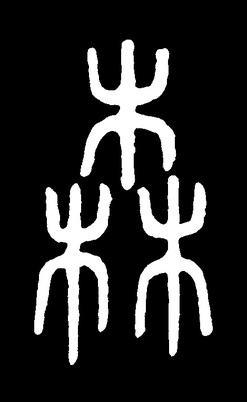 There is much confusion on the subject of how to classify Japanese kanji or, in other words, Characters of Han China (漢字). I often see websites, or even books, devoted to Japanese language and culture, where we read this and that about Japanese letters, or Chinese symbols, or anything equally intellectually challenged.
To elaborate on the title of this article, we need to look at the definition of the word "letter" first. Letter is a stand alone linguistic unit of a written language representing one or more of the sounds used in speech. Letters form alphabets. Letters DO NOT bear any meaning. The Japanese word 文字 (moji) means "a character" or "characters". It is often shortened to 字. But the character 字 also means "letter", "symbol", "word", etc. It would seem that the phrase "Japanese letter", or "Japanese symbol" is yet another erroneous translation from Japanese to English, or from Chinese to English, as if we did not have enough of those laying about (see my article where I talk about the "grass script"). Chinese character (or Japanese kanji), unlike letters, may have multiple meanings, and they DO NOT form an alphabet, but a writing system based on logographic characters (or ideographic logograms). Chinese characters are also known as sinographs. There are six major groups into which one can divide Japanese kanji. I will discuss this in separate articles. Last but not least, only because you see an ancient Chinese character, such as the one you see in the picture above, it does not necessarily mean it has to be a pictograph. This particular kanji is 森 (Japanese: mori, i.e. woods), and although it is composed of three pictographs of a tree (木, Japanese: ki), it belongs to a group of characters that are a combination of two or more pictographs, or characters whose meaning is based on an abstract concept. This group is known in Japanese as 会意文字 (kai-i moji). Characters of pictographic origin form one of the six groups of Chinese characters. In other words, some of the Chinese characters are pictographs, but this group of characters is not that large at all. There are over 90,000 (yes, you read correctly, it is ninety thousand) Chinese characters out there. 85% - 90% of them belong to a group known as the samasio-phonetic compound characters (形声文字, Japanese: keisei moji). Such characters, as the name suggests, are composed of semantic and phonetic radicals. Summarizing, do not trust blindly "serious" literature on the subject of Chinese or Japanese linguistics. For example, I can tell you now, that ALL books that I saw on the etymology of Chinese characters are either entirely incorrect, or incorrect in a large part. Those are either based on no research at all, or a research done so poorly, that the authors should pay damages to whoever buys their books. Often times authors base whatever they write on other English authors, who are also wrong, or on outdated research preceding the discovery and analysis of the oracle bone script (甲骨文). I am currently working hard on changing this unacceptable status quo, on which subject I will be able to update you in next month or two. 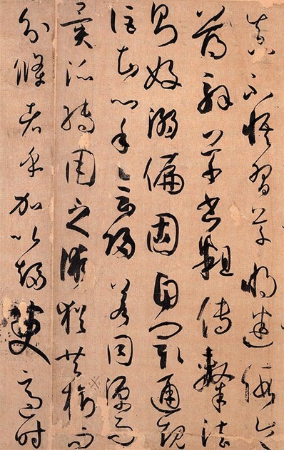 Writing in cursive hand could be compared to a skilled martial artist, who does not think, but reacts instinctively when performing various techniques. Constant and extensive studies are the only path to mastering this script. In the history of Chinese calligraphy art, there were a few calligraphers whose cursive script skills were beyond human perception. Those were, Dù Dù (杜度, early 1st century C.E.), Cuī Yuàn (崔瑗, 77-142 C.E.) , Zhāng Zhī (張芝, died 192 C.E.), the sage of cursive hand Zhāng Xù (張旭, 8th century C.E.), who was also the creator of wild cursive hand (狂草, kuáng cǎo), Huái Sù (懷素, 737–799), the brilliant drunk monk, the Two Wangs: Wáng Xīzhī (王羲之, 303–361) , the sage of calligraphy, and his son Wáng Xiànzhī (王獻之, 344 – 386), Sūn Guòtíng (孫過庭, 646–691), also known as Sūn Qiánlǐ (孫虔禮) whose Treaties on Calligraphy (書譜) is not only a well of knowledge on calligraphy but also a bible of cursive script forms (see a fragment of this masterpieces in the picture to the left), and Xiān Yú Shū (鮮于樞, 1246 – 1302). Naturally, this list does not exhaust the list of brilliant Chinese calligraphers, who excelled in cursive script. You can view and read about the masterpieces of some of those Masters, here.
Very popular way of studying cursive script is by performing rinsho (臨書, lit. “facing and writing”, i.e. copying of masterpieces) of “Thousand Characters Essay” (千字文), an essay (written as a rhyming poem) composed of 1000 non repeating Chinese characters, in the first half of 6th century C.E., by Zhōu Xīngsì (周興嗣, died in 521), upon the order of the Emperor Liáng Wǔ (梁武帝, 464 - 549), for the sole purpose of calligraphy education. Many great calligraphers copied this text imbuing it with their own style, writing it in two, three or even more forms, one aside another. Reading and copying standard (楷書), semi-cursive (行書) and then cursive forms character after a character is considered one of the best and most proper ways of beginning and continuing studies of Chinese calligraphy. 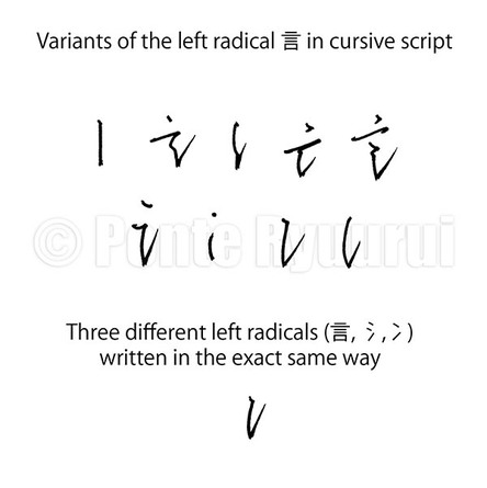 Simplifying certain radicals in cursive hand carries dangers. Left-hand side radicals such as 言 (gen, i.e. “word”), 氵 (sanzui, i.e. “water radical”), and 冫 (ni sui, i.e. “ice radical”), can be written in the exact same way. Therefore, the only way of deciphering the meaning of the given text will be either studying the right-hand side of the character, or guessing it from the context, which by the way will be quite intuitive in cursive script. On the other hand, one radical can be written in various manners. If we take 言 as an example then it can appear in one of the forms shown in the picture (left).
Chinese calligraphy in cursive script is, or ought to be, written without thinking or planning. Any pondering or hesitation will ruin the flow of precious energy. Thus, there is no time for deciding how to write given character. It happens automatically. And since some characters have repeating radicals, it is the calligrapher’s mastery level of the art that will determine how rich in various forms the text will be. None of the Chinese scripts is rule free. Cursive hand is no exception here. These are: 1. Merging strokes that are separated in standard form 2. Changing the starting point of a following stroke 3. Dots merged in one single line 4. Straight lines are represented by curved lines, sharp corners by loops 5. Reduction of total number of strokes 6. Long lines are shortened or symbolised by dots 7. Complex radicals are significantly simplified 8. There is a change in a positioning of given stroke 9. Stroke order is altered 10. Starting point of an initial stroke is changed This does not exhaust the subject of cursive script. Its another very characteristic feature is so called “unbroken line” (連綿体i). This technique is also essential in Japanese kana script, which was based on cursive forms of Chinese characters, or more precisely, manyōgana (万葉仮名, lit. "kana of ten thousand leaves [words]"). The “unbroken line” is the connection, be it visible or not, between the characters. In other words, an instance where two or more Chinese characters are literally or metaphysically combined into one flow. If a calligrapher was to stop after each Chinese character, and think how or where to write the next one, the flow would be broken. The secret of the rhythm and beauty of cursive hand lies in both well balanced forms of the characters, as well as the natural appearance of the composition, that allows the eye of the reader to glide with ease down the row of Chinese characters. “Unbroken line” seeks its way through a page of paper as a mountain creek searches for the shortest way to the sea. The undisturbed flow of energy (行氣) is the beating heart of cursive hand.  Cursive script is extremely intriguing. It is difficult to read, write and even to place its origin on a timeline (see this link to read my articles on the history of calligraphy and calligraphy scripts). Its definition is irregular and very flexible, just like its appearance. Even though it was, and still is in some cases, the most common script used daily by all the nations whose language is based on Chinese characters, not many of the modern native speakers can actually decipher it, let alone apply it with natural fluency in every day written communication. Modern civilization and computerisation of lives is to blame. It is no wonder, however, that the vast possibilities of expressing oneself are the reason for so many calligraphers to prefer to write in cursive hand. It is dynamic, abstract, passionate, favours subconscious creativity, and it is extremely expressive. Calligraphy written in cursive script may seem to be a maze of random brush strokes, or a late Picasso painting of anaconda snakes mating in their nest, but the paradoxical feature of it is that despite its random looks, cursive script requires a lot of precision and knowledge. 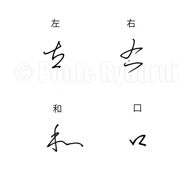 The studies of cursive script are long and taxing, starting with learning the basics of standard (楷書), semi-cursive (行書), and clerical scripts (隷書). Even though, historically speaking, cursive script preceded semi-cursive and standard scripts, it could be seen as an allegory for all three. The concept of cursive script is to emphasise the most characteristic features of the characters, and simplify them into a form that allows for faster and more fluent writing. However, those “shortcuts” are not any near being random, but rather carefully designed blueprints by some 2000 years of practical use.
There are two major factors of cursive script that define its complexity. First one is that to writing in a way that brush is lifted from the paper surface as few times as possible (see my articles on the “unbroken line”). The second one is omitting and simplifying certain parts of a characters. As you may know, Chinese characters are built of radicals. Some characters may have completely different meaning, even if they share the same radicals (or radicals that look identically or nearly identically in modern standard script form). For instance 左 (hidari) means “left”, whereas 右 (migi) means “right”. The appearance of the 𠂇 (Japanese: sa, i.e. pictograph of a hand) seems to be nearly identical in both characters in the standard script, but its cursive forms will differ. This is because the etymology of the character 左 tells us that 𠂇 depicts the left hand, and in 右 it depicts the right hand. The stroke order of both differs in seal script (篆書), hence the difference in writing in cursive script. The stroke order of writing both characters in standards script also differs. Those may seem like small nuances, but such details have a massive impact on the composition and the flow of writng. Even in the case of a simple radical 口 (kuchi, i.e. “mouth”), the cursive forms might, or might not, have similar shapes. It all depends on the overall appearance of given character, or the calligraphy work composition. For example, it is possible that a cursive form of the Chinese character 口 in 右 may be written in a completely different way than that in 和 (wa, “harmony”), and usually it is so (see the diagram above). I invite you to view my tutorial on cursive script (videos included) 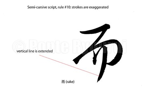 Links to the other 9 articles on writing rules in semi-cursive script (行書), are to be found here. Unlike in standard script (楷書), the structure of Chinese characters written in semi-cursive script is more relaxed, and sometimes even distorted on purpose. Calligraphers use this to their advantage in order to create more expressive calligraphy art. The exaggeration of stroke(s) usually counterweights other over accented parts of a given character, or even the whole text. It is an important thing to bear in mind, that good calligraphy is not about every character being written correctly or harmoniously, but about the mutual communication among the characters in the entire work. The above diagram shows the last stroke of the character 而 (Japanese: rake / Chinese: as well) has its last vertical stroke intentionally extended. It adds more drama and kinetic energy to the appearance of this character. Exaggerating of the strokes should be performed with caution, as there are limits to it, and not all strokes can be (or should be) distorted this way. 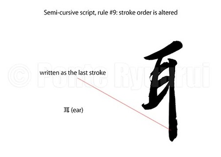 To read more on other rules of writing in semi-cursive script (行書), please see the the full list. There are many variants of stroke order when it comes to writing Chinese characters. The same character written by Chinese, Japanese, Taiwanese or Korean calligrapher, may have a different stroke order. In case of the character 耳 (ear), the Japanese stroke order varies from the Chinese one. The long vertical stroke is written as the last one in Japan, whereas in China it is the 3rd stroke. Now, since we are discussing Chinese calligraphy script, I will follow the Chinese stroke order. Consequently, if the long vertical stroke is written as the last one in semi-cursive script (although it does not have to be so), then the stroke order is changed. If you watch the video (below), you will understand why it feels more natural to change the stroke order in semi-cursive script, in this particular case. Being based on the concept of the unbroken line (連綿), alteration of the stroke order allows for faster and more fluent writing. 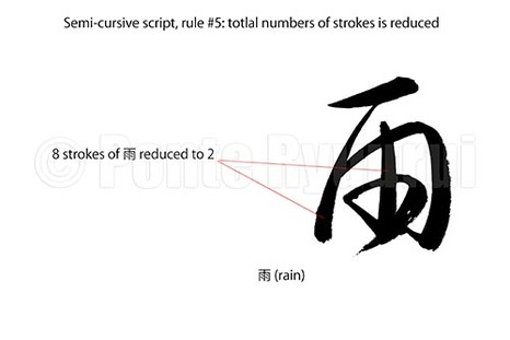 More about other rules of writing Chinese calligraphy in semi-cursive script (行書), here. The reduction of strokes is one of the main purposes of semi-cursive and cursive (草書) scripts. It allows for more fluent and emotional writing. This rule of writing corresponds with the technique used in both Chinese and Japanese calligraphy art, known as unbroken line (連綿). In the diagram (top left), you can see kanji 雨 (rain), which has 8 strokes in standard script. The pictured semi-cursive form was written with two brush strokes only. It is to be said that virtually nearly any rule of writing calligraphy stays in close relation to other rules. For instance, you will notice that the 4 dots of of the Chinese character 雨 were merged into a single curved line, which would be the rule #3 of semi-cursive and cursive scripts. 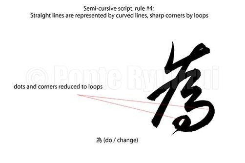 See my other tutorials on semi-cursive script (行書), here. This is very similar rule to the one of cursive script (草書), where corners and straight lines are round up to loops. The diagram (left) shows a character 為 (do / change) written in semi-cursive script. You will notice that the entire composition was softened, in comparison to the standard script (楷書) form of this character. Marked are the corner strokes, which are converted into a curved line (5th stroke), and a loop (4 dots and and hook are simplified). Such modifications are not as common and as over emphasised as it can be observed in cursive script form of this, and other, characters. Chinese calligraphy does not offer a recipe for simplifying lines and corners with loops, and diligent studies of the Chinese masterpieces are a sine qua non stage on the path to intuitive understanding of how to apply this rule in practice. 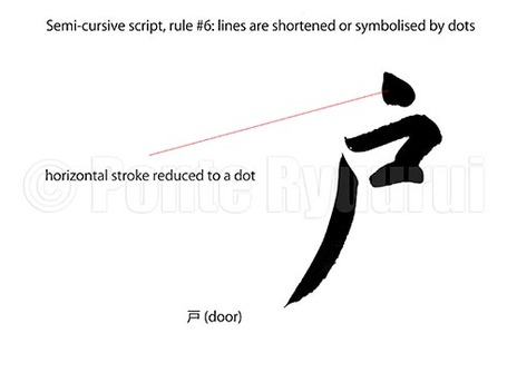 To learn about other rules of writing in semi-cursive script (行書), follow this link. This rule corresponds with the rule #6 of writing Chinese calligraphy in cursive script (草書). The concept is very similar, and the aim is to reduce the characters structure and make it more compact. Also, it speeds up writing, which is one of main purposes of semi-cursive and cursive scripts. In case of the character 戸 (door), except the top horizontal line, which was reduced to a dot, the character structure could be classified as a relaxed standard script (楷書). The differences between the regular script and semi-cursive can vary from be subtle to drastic. Sometimes, it may be difficult to classify a single character, especially that there are many various types of standard and semi-cursive scripts. Semi-cursive script will offer fewer opportunities for reducing lines to dots, in comparison with cursive script (草書). 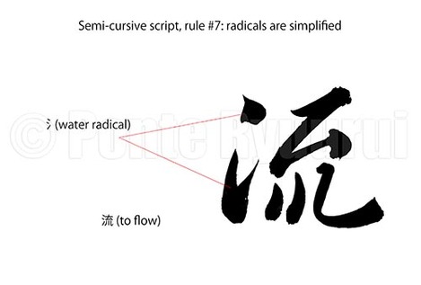 To view other rules of writing Chinese calligraphy in semi-cursive script (行書), click here. Similarly to the rule #7 of writing calligraphy in cursive script (草書), the radical can be simplified in semi-cursive script. The difference is, that the simplification is not as significant as incursive script. There is a delicate border between the semi-cursive script and standard script (楷書) on one side, and cursive script on the other. Cross-over scripts are known as standard-semi-cursive (楷行書), and cursive-semi-cursive (行草書). Depending on the degree of simplification or formal appearance of strokes, semi-cursive script can resemble either of the scripts that it serves as a bridge for. In the above diagram you can see the water radical (氵) written in two brush strokes, and not three as in standard script. The same form can be used in cursive script, though the top dot is usually connected with the bottom part of 氵 by the unbroken line (連綿). 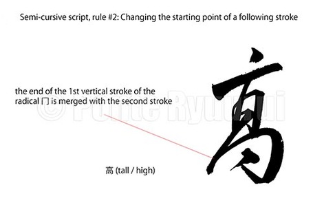 To read more on other rules of writing in semi-cursive script (行書), please see the the full list. Merging two or more strokes into one brush stroke usually alters the appearance of given character. The trick of Chinese calligraphy is to change the structure of a character, without distorting the balance. Radical changes, such as altering of the starting point of a given stroke, will distort the shape of a given kanji radical. In the the above diagram, the character 高, or more precisely 髙, which is a kanji variant (異体字) of 高, has the 冂 (upside-down box radical) disformed by a change in the starting point of a second stroke of that radical. The steep slanting vertical line in the "squashed" radical 冂, corresponds with the top thick vertical line, forming a visual enclosure for the middle part of the character. The kanji seems distorted, but it is balanced. That is a beauty and magic of semi-cursive and cursive (草書) scripts. The entire structure of 髙 is "fastened" with the unbriken line (連綿) technique, which adds additional drama and movement. 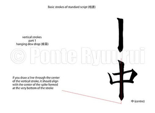 To read more on other types of strokes in standard script (楷書), please click here. Vertical strokes of standard script are among the most difficult brush strokes in Chinese calligraphy. They are complex (many micro brush movements) and require a lot of practice. The differences between the vertical strokes of Chinese calligraphy can be brought down to stroke endings. The foundation on which each of those strokes is built, is known as the "iron pole" (鉄柱), and it is one of the 8 core strokes of standard script (永字八法). The name "hanging dew drop" (垂露) comes from the appearance of the ending of this type of vertical stroke. It resembles a drop of dew hanging at the very end of a branch, or a twig. Chinese calligraphy and its theories are heavily related to nature. Many Chinese calligraphers based their calligraphy styles (書風) on natural phenomena. A falling rock, moves of a female sword dancer, geese turning their heads, etc. The difficulty of writing a hanging dew drop stroke, is in the challenge of presenting the kinetic energy of the water droplet, that is growing on the tip of a small branch. The video (below) shows only one style of writing the hanging dew drop stroke, which evolved during the Tang dynasty (唐朝, 618 - 907), and it is often found in the masterpieces of Ouyang Xun (歐陽詢, 557 – 641) . 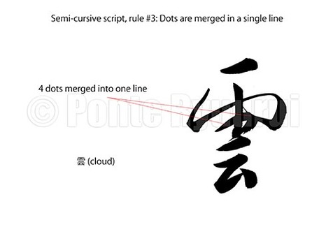 To read more on other rules of writing in semi-cursive script (行書), please see the the full list. Similarly to the third rule of writing Chinese calligraphy in cursive script, in semi-cursive script dots can be merged into a single line, too. Often times dots are connected in a way that even though they are written with a single brush stroke, one can still distinguish how many dots were merged. Naturally, the level of fluency of writing and its suppleness depend on the style of writing. It is important not to mistake a Chinese calligraphy script (書体) with a Chinese calligraphy style (書風). Those are two completely different terms. In the diagram above, I wrote the top part of the character 雲 (cloud), which is ⻗ (rain radical) in a manner closer to the cursive script (草書), whereas the bottom part stays closer to the standard script (楷書). This creates a good balance between a heavy and wide top and a narrow, built out of fewer brush strokes, bottom. The 4 dots of the ⻗ radical are merged into a single line. Watch the video below to see how I write it. 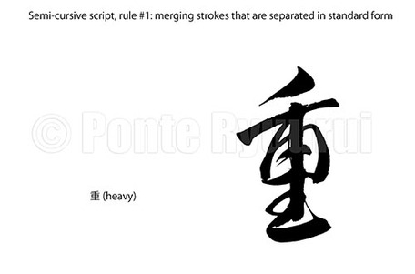 To read more on other rules of writing in semi-cursive script (行書), please see the the full list. This rule is identical with the rule #1 of writing in cursive script (草書), which says that certain strokes can be merged in one brush stroke. Naturally, semi-cursive script is not as laconic in form as cursive script, so even though similar rules apply to both scripts, the appearance of the same Chinese character will differ (in most cases). The diagram (above) shows the character 重 (heavy) written in semi-cursive script. This character counts 9 brush strokes in standard script (楷書). Semi-cursive script form of this Chinese character can be written in multiple ways, but the one shown in the picture has several strokes merged in one continuous brush stroke. Notice, that the 2nd, 3rd and 4th strokes are combine, and then 6th, 8th, 9th and 7th, as the last one, are also merged in one unbroken line. This form of semi-cursive script of the kanji 重 follows yet another rule of writing which will be discussed in a separate article. The stroke order of writing this character is altered, and the 7th stroke (vertical line) is written as the last one (watch below video to see how it is executed). 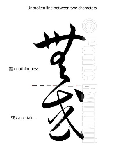 To read part 1 and 2 of this tutorials, please see the cursive script tutorials page. Visible unbroken line, that connects two or more characters (some masterpieces have lines with 20 characters or more being merged in a single brush stroke), is a technique often used by Chinese and Japanese calligraphers. The way of connecting two characters is not random, and it should by no means not distort the structure and balance of either of the Chinese characters. It is performed with a single brush stroke, without the brush leaving the paper surface. Merging more than 3 character with the unbroken line technique is more common in Japanese calligraphy than Chinese calligraphy. This tradition takes its origin in Japanese kana calligraphy, in which hiragana (平仮名) and hentaigana (変体仮名) syllabograms are combined in long ribbons of ink. There are also styles of calligraphy which are based on writing the entire text in one brush stroke, which I believe was initiated by a brilliant calligrapher of the late Ming Dynasty (明朝, 1368 - 1644), Wang Duo ( 王鐸, 1592 - 1652), who was inspired by the ippitsu technique (一筆書, lit. one brush stroke calligraphy) found in the Chinese calligraphy masterpieces by Wang Xianzhi (below) of the Jin dynasty (晉朝, 265 - 420). One of the most famous Chinese experts on the unbroken line, was Wang Xianzhi (王献之, 344 - 386), the 7th and most talented son of famous Wang Xizhi (王羲之, 303 - 361), though the unbroken line had appeared much earlier. It was a technique used already during the late Han Dynasty (漢朝, 206 B.C.E. - 220 C.E.) by a brilliant calligrapher, Zhang Zhi (張芝, died 192), who excelled in the cursive script (草書) of Chinese calligraphy. Visible unbroken line is very difficult to execute in a way that will not ruin the composition and the energy flow (行氣), which are the essential elements of good calligraphy. Diligent studies of cursive script masterpieces is a sine qua non step towards mastering this technique. Suggested calligraphers are, except those three mentioned above, Zhang Xu (張旭, he exact dates of birth and death are unknown) and the monk Huai Su (懷素, 737–799 C.E.), of the Tang dynasty (唐朝, 618 – 907), who are well known as “Crazy Zhang and Drunk Su (顛張醉素)".
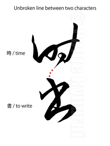 To read more about the basic concept of unbroken line in Chinese and Japanese calligraphy, please see part 1 of this tutorial. An implied unbroken line between two characters appears in virtually any of the Chinese or Japanese masterpieces in either cursive (草書), semi-cursive (行書) or kana (かな) scripts. The reason for it is very simple, and it is directly related to the direction of writing Chinese calligraphy, but also Chinese aesthetics and philosophy. Traditionally, Chinese characters are written from the top of the page to the bottom, and right to left. Then, the general rules of the stroke order, applied during writing any of the Chinese characters, follow the direction from left to right and top to bottom. Consequently, a brush in hands of a skilled calligrapher moves freely, gliding from one character to another. Both types of the unbroken line (visible and invisible) are a natural outcome of the traditional methods of writing Chinese calligraphy. Invisible unbroken line amplifies the artistic values of calligraphy. When you look at a row of Chinese characters, connected with an invisible unbroken line, your eyes will see much more than it is written. Although the line does not exist, and the connection is only metaphysical, the calligraphy text will appear to be more expressive and richer in form. Similarly to ink painting, Chinese calligraphy is an abstract art. The beauty of both is often hidden in what is not physically sensible. The only way to understand how and where to apply the unbroken line during writing, is through diligent studies of Chinese and Japanese calligraphy masterpieces. 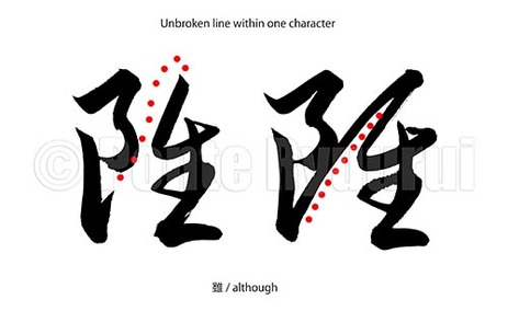 The unbroken line (連綿) is a very characteristic element to both Chinese and Japanese calligraphy art. It is easily detectable in cursive script (草書), perhaps even more defined in Japanese kana script (かな). The unbroken line technique is also applied in semi-cursive script (行書), and even some styles of standard script (楷書). The concept of the unbroken line is based on either direct or indirect (visible or invisible) connection between the strokes within one character, or between two or more characters. If you look at the above picture, you will notice that both halves of the right-hand side character 雖 (although) are connected with one brush stroke. Although, in the left-hand side character both halves are separated, the connection is invisible. The brush leaves the paper surface and traces a curved line in the air, to the point where it descends onto the paper once more, in order to complete the right half of the Chinese character. The unbroken line (especially the invisible one), aside defining / altering the structure of Chinese characters executed in a given script, it introduces a rhythm of writing. That rhythm is the foundation of writing Chinese and Japanese calligraphy (especially in "faster" scripts). To be able to apply the unbroken line technique, one has to master the stroke order of Chinese character, and rules of writing in a chosen calligraphy script. This technique does not allow for hesitant writing. I intentionally placed the unbroken line tutorials in the section referring to cursive script, because this technique is mostly used during writing in running hand. 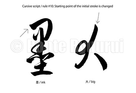 To read on the other 9 of the rules of writing in cursive script, see this menu. The 10th rule of writing Chinese calligraphy in cursive script allows for a change of the starting point of the initial stroke. This cursive script rule offers one more tool that enhances the expressiveness and fluctuant nature of cursive script. Changing of the initial position of writing a stroke alters the appearance and balance of the whole character. If you look at the character 大, you will notice that the horizontally rectangular form of this character in standard script (楷書). To fluently and freely apply the rule #10, one has to master and understand the proper stroke order of Chinese characters in standard script. The ten rules of writing Chinese calligraphy in cursive script are the foundation and the elemental knowledge required for mastering both reading and writing in running hand. |
Categories
All
AuthorPonte Ryuurui (品天龍涙) Archives
August 2020
|

 RSS Feed