|
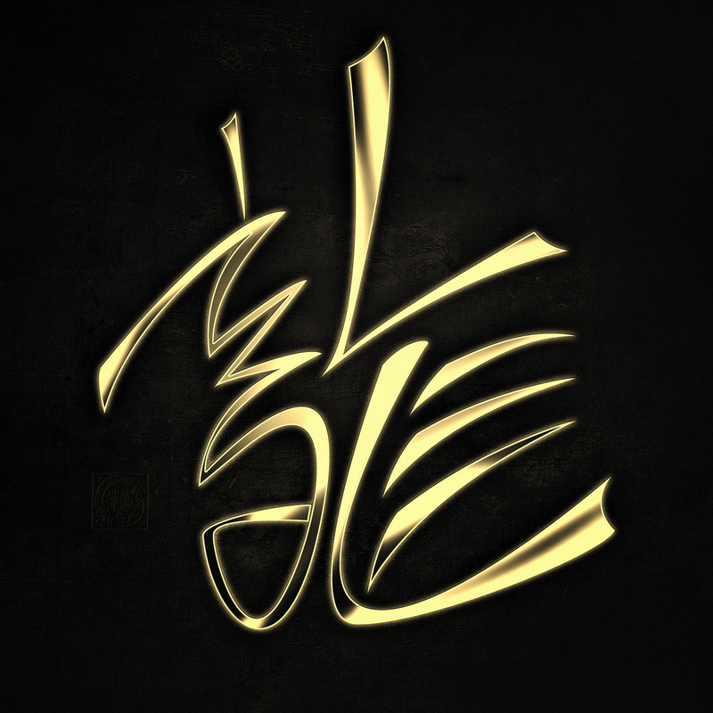
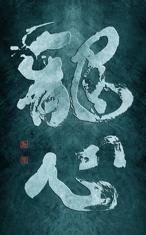
This is my first fully digital Chinese calligraphy art, based on a semi-cursive script form of the character for dragon (龍). I created it entirely inside photoshop from scratch using pen tool, textures and a bit of fun with selective toning, etc. I also added some dimension to the character, so it doesn't appear flat, and created an illusion of metallic material. The character itself follows traditional calligraphy rules to certain extend, naturally I added to it my personal calligraphic style, but I wanted to keep it in a modern feel, slightly leaning towards a logo design or some sort of an emblem. Hope you guys like it!
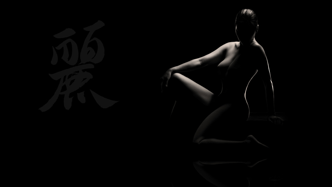
My Youtube channel with free photoshop tutorials Photography workshops in Tokyo - click for more details. Hire a photographer in Tokyo Buy original Chinese and Japanese calligraphy art Check out my new portrait photography website! Flash photography has the great advantage of offering an immense control over light. You can sculpt it and bend it the way you want. It is great in working in confined spaces, where strobes would blast the place with light like x-rays. Flash throws some very hard light, but when softened up with some light modifiers like softboxes is just amazing. Here is a result of a short photoshoot at my place today, I added my calligraphy to make the image a bit more interesting and dill the negative space to the left. I dropped the opacity so the attention goes to the model, which is mirrored by the faded kanji (麗 - graceful). My Youtube channel with free photoshop tutorials Photography workshops in Tokyo - click for more details. Hire a photographer in Tokyo Buy original Chinese and Japanese calligraphy art Check out my new portrait photography website! model: Eccaia
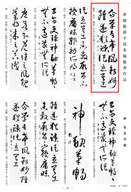
Every month several outstanding works are chosen from among the thousands of calligraphy works flowing in from whole of Japan, and are being printed to share with the community of calligraphers in Japan. I am very honored to have my work chosen for this month edition of the All Japan Calligraphy and Literature Association magazine. It is a copy of a fragment of treatise on calligraphy by Sun Guoting, late 7th century, in cursive script, size 35x135 cm. IT is one of the most emotional and insightful classics regarding the beauty and depth art of Chinese calligraphy. The remark of the judges to the left says: Ryuurui / a delightful work where brazen and rich brush strokes are interwoven with a light and sparkling line. I scanned the entire page so you can also have a look at other calligraphers` works.
My Youtube channel with free photoshop tutorials Photography workshops in Tokyo - click for more details. Hire a photographer in Tokyo Buy original Chinese and Japanese calligraphy art
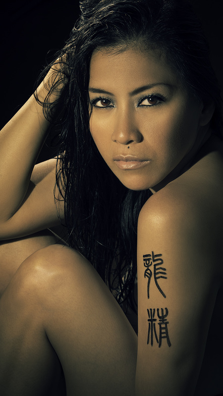
Due to increasing amount of emails and inquiries regarding Japanese kanji tattoos written in calligraphic scripts, I decided to launch a new service page with all the details and prices. Tattoos are for a life, so when searching for a design we want something unique. Tattoos in Chinese characters are common, but I have rarely seen any decent ones, not to mention any good ones. If you are looking for a Japanese kanji tattoo design you should look for someone knowledgeable in the era of Chinese characters and Japanese or Chinese calligraphy. Tattooing computer fonts is a blasphemy, not to mention that such tattoos look really boring. IT may seem cool in the Western countries, but whenever you meet any native speaker of a language that utilizes Chinese characters, your tattoo will not be appreciated. Below photo - calligraphy in ancient Chinese small seal script, reading 龍精 - dragon spirit. Model: Eccaia
My Youtube channel with free photoshop tutorials Photography workshops in Tokyo - click for more details. Hire a photographer in Tokyo Buy original Chinese and Japanese calligraphy art Here are two out of four mandatory works that I have to write for my upcoming Master Instructor exams in Japanese and Chinese calligraphy. Those works are a must on top of 36 works that have to be sent throughout a year, each month one work. The exam is split into copying from Chinese classics and two works written in one's own calligraphy style, but in a way where characters show a clear connection to traditional and historical characters that one has to research and carefully select from various Chinese and Japanese classics. Below you can see two works that were chosen by my teacher as those that qualify for exam submission. There is a deadline for the exam, and if I am unable to meet the requirements , or in other words,, if my teacher does not think one or more of my works is strong enough for exam submission, I would not be allowed to send them to the national judging panel. So, you write as many works as it takes until they are good enough to be submitted, or else you have to wait another year to lift your skills. The work to your right is a copy of Chinese classic 乙瑛碑 from 2nd century C.E. in clerical script. To the left is a work in my own calligraphic style, in semi-cursive script (自然風月情無盡如在山林楽未央). During my last meeting with my teacher he picked 4 works, the other two were in standard script and cursive script, but he asked me to keep writing as he was not fully satisfied.
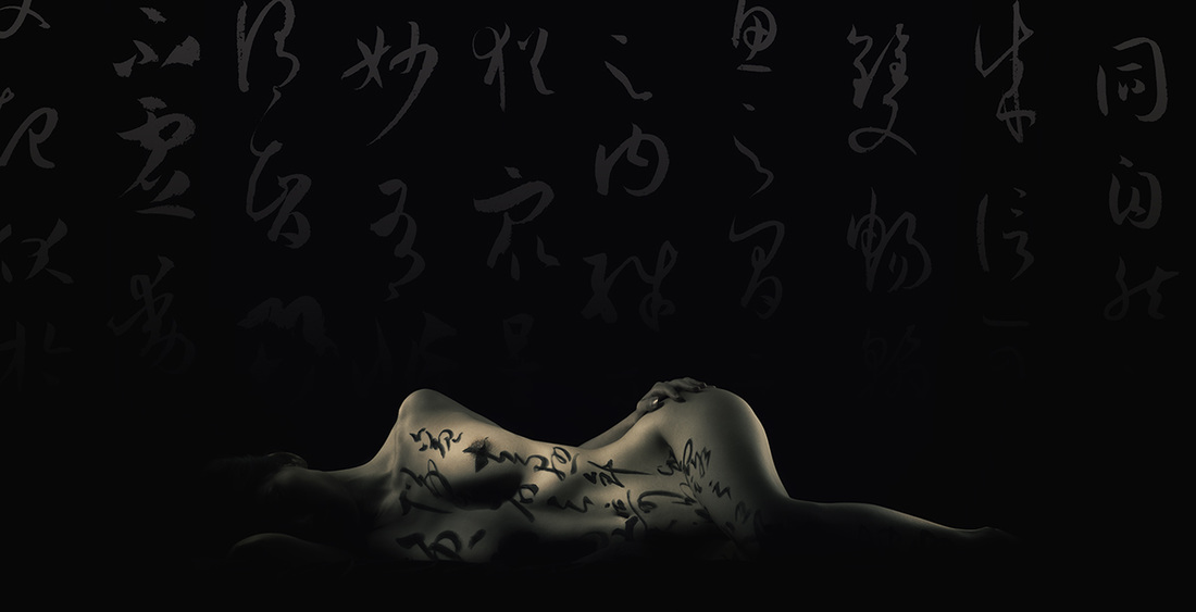
Working on photos and editing tons of shots may lead to tunnel vision and resulting in similar type of edits. Lots of people use presets, not even knowing what they do. That includes the professional photographers as well. Some people don't even possess the skill to edit their own work, which is pretty scary. It is like a cook who buys veggies on the market and calls for help to cook the meal. Learning and studying will develop your artistic vision, and it is most likely to change over the time. I learn new skills on a daily basis, and my photoshop techniques improve quite rapidly. I am often revisiting some of my favoring works and re-editing them applying what I have learned since I worked on them. Sometimes I give photos a new twist. All in all I love editing 1 photo in many different ways. It leads to amazing discoveries. In this case the reason for editing is complex. One, is that I love this shot. Two, is that I love this calligraphy classic, and three is that this very classic is one of the mandatory subjects for my Master Instructor exams in calligraphy this year.
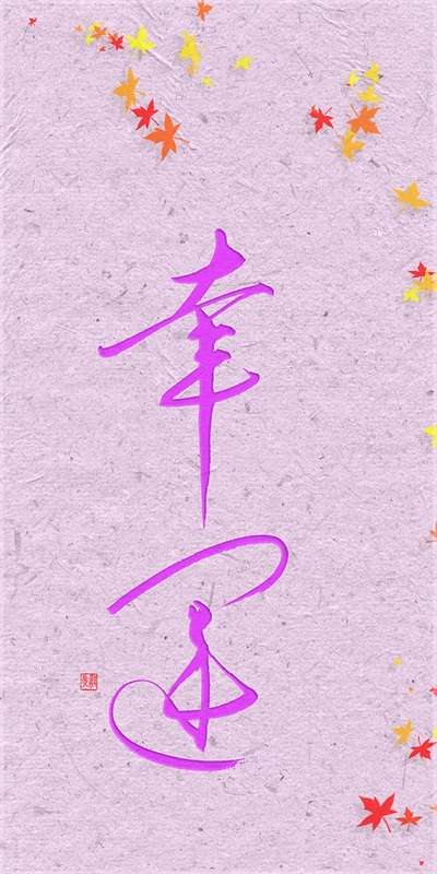
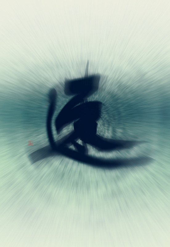
model: Asuka / Japanese calligraphy - my copy of a Chinese classic Shu Pu from the early Tang Dynasty (7th century) by Sun Guoting, who was an absolute genius of cursive script. I love the fusion of that is ancient and traditional with what is modern. There are not many types of art, which would be so sophisticated and so ancient as the art of Chinese calligraphy, Japanese calligraphy was derived from the former around 5th century C.E. The history of Chinese calligraphy, on the other hand, is monumental, and goes ca. 7000 years back (see my articles on the Yangshao culture markings in Neolithic China). My daily studies of calligraphy are based on more "modern" classics, no older that 3600 years. This calligraphy was written with a huge marker pen on a paper, brought into photoshop, and I added some textures to it, and post processed the entire image. Kanji: 速 / meaning: speed.
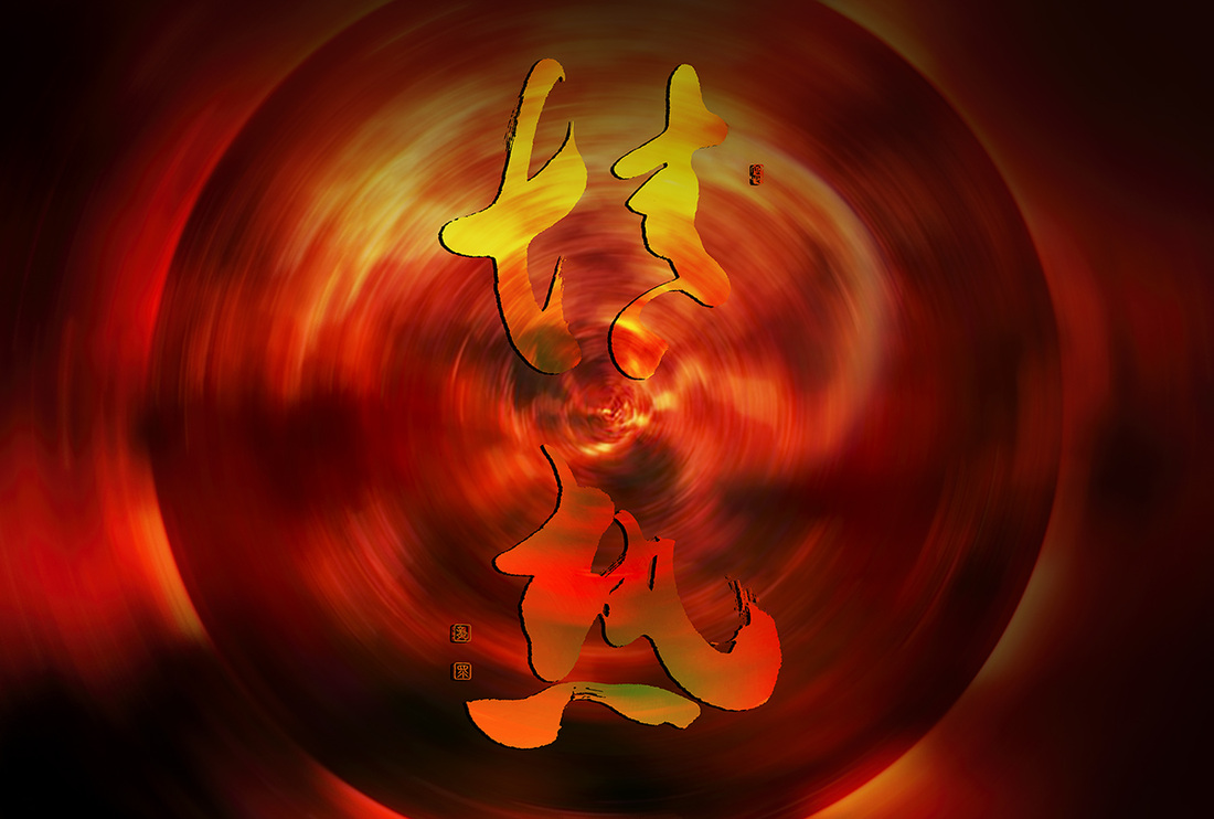
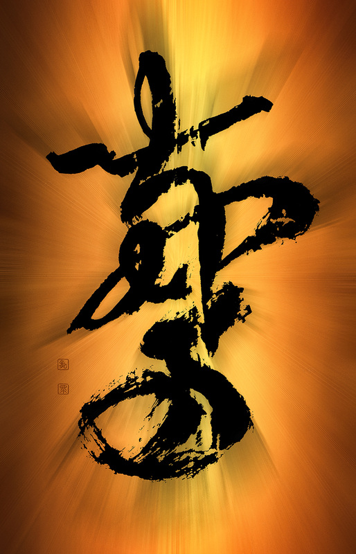
Photo editing & Chinese and Japanese calligraphy tutorial videos Buy fine art calligraphy prints at my store in my store on Fina Art Amercia. 情熱 (jōnetsu) means passion in English. It also stands for enthusiasm and zeal. This very calligraphy can be found in one of my books, and more precisely in my poetry book, the Soul Nova, together with two other works of mine. The book has three chapters and each of them is opened by one of my calligraphy art works, though they are all black on a white background. I gave this calligraphy a new look by adding some colours. Passion and zeal is always associated with energy, power, and spirit. Bright warm and strong colours fit perfectly, I also added movement and kinetic energy symbolising spinning mind and soul.
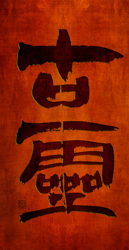
Photo editing & Chinese and Japanese calligraphy tutorial videos Buy fine art calligraphy prints at my store in my store on Fina Art Amercia. Copying Chinese calligraphy classics is the main way of studying Chinese calligraphy, and it has been practiced for over 3500 years. In this video I am copying a short fragment from a 4th century classic by the calligraphy sage Wang Xizhi. It is a text of Heart Sutra in semi cursive script. If you wish to learn more about Chinese calligraphy, its history, classics, great Masters and masterpieces, feel free to visit learning section on my website. To view my Japanese and Chinese calligraphy portfolio, see here. Photo editing & Chinese and Japanese calligraphy tutorial videos Buy fine art calligraphy prints at my store in my store on Fina Art Amercia. I have just published another calendar for the year 2015, which is a year of the goat. This calendar contains 13 original Chinese calligraphy works of mine, all written in ancient seal script, following the original forms of characters found on various seals, monuments, bronze artefacts and other historical items from the times of ancient China. All those calligraphy works will be available from my store with calligraphy prints. So anyone interested in the entire collection can buy all 13 works. They are all in identical sizes. The 12 signs of the Chinese zodiac are: 1-Rat 子 2-The Ox 丑 3-The Tiger 寅 4-The Hare 卯 5-The Dragon 辰 6-The Serpent 巳 7-The Horse 午 8-The Ram 未 9-The Monkey 申 10-The Bird 酉 11-The Dog 戌 12-The Boar 亥. The calendar cover represents character 羊, which is the regular Chinese character for a "goat". The zodiac signs are represented by special characters. Below you can see the previe of all 12 months, and the cover. Calendar size is 13.5" wide x 19" high. Also see my phgotography calendars at my store, here. Photo editing & Chinese and Japanese calligraphy tutorial videos Buy fine art calligraphy prints at my store in my store on Fina Art Amercia. Clerical script is one of my favourite scripts in Chinese calligraphy. It is raw, abstract and powerful. It feels ancient and sacred. It allows for the brush to glide on paper back and forth in a beautiful rhythm. The reverse brush technique is very soothing and relaxing, and allows for entering a meditating state of mind. Text: 古霊 / ancient spirit /soul.
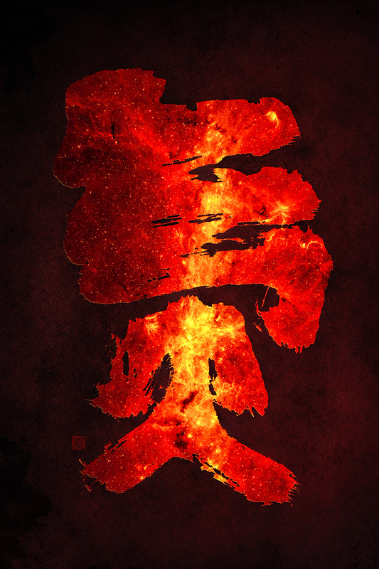
氣 has many meanings, which is not uncomon for Chinese characters, but it could be translated as "spirit" or "energy". I wrote this calligraphy using the youngest script of Chinese calligraphy - the semi-cursive script, and by youngest I mean the last one to appear. However the character shape is based on its clercial script form, eaily over 2000 years old. This work will be soon available in various printed forms in my store, here.
Wang Xizhi (王羲之, 303 - 361) - the Sage of Calligraphy and possibly the greatest Chinese calligrapher that has ever lived. His masterpieces are often a great challenge, as his skills with the brush were unreal. The most striking thing for me is his unbelievable sense of the balance in writing, combined with an extremely intuitive ability of adjusting shape of the characters so they fit together, but at the same time pushing that harmony to the limits of distortion. A true genius artistic indeed. Here is a short video that I captured during my daily Chinese calligraphy studies, I am copying a 興福寺断碑 (Xingfusi duanbei), which is a calligraphy text composed in 721 C.E. out of characters in semi-cursive script (行書) taken from various masterpieces by Wang Xizhi. I have another video of me copying the same classic, but I am using a different brush holding technique, you can see this video on my YouTube channel, here. If you want to learn more about Chinese calligraphy, please see the section of this website with learning materials.  Chinese calligraphy of the Northern Wei dynasty (北魏, 386 - 534 C.E.) has one of the most powerful standard script styles in the history. If your calligraphy is lacking the bones and structure, you should definitely study masterpieces of this period. It happens so that from this month my obligatory montly subject for my next year's Master Instructor exams is one of the most famous classics of this period - the 鄭羲下碑 (Jap.: Teigi ka hi). The most characteristic features of this style are the rounded stroke (so called enpitsu in Japanese / 用筆) and the the strokes being between the standard and clerical scripts. The work to the left is my copy of this classic. Since the original is carved in a natural stone, I edited it in photoshop so it resembles characters carved on a hard stone-like surface. This work is available in a print form in my store, here. Here is my new calligraphy art, 龍心, i.e. dragon heart (can also mean, dragon mind, or dragon spirit). As always, I wrote the calligraphy in a traditional manner with a brush, and then processed it in photoshop, which, as you probably noticed, I love doing. The Chinese characters are executed in semi-cursive script. To view my other calligraphy works, see my portfolio.
If you are interested in purchasing custom calligraphy art prints, please visit my store on Fine Art America, and if you wish to order something specific, a custom art, then please feel free to contact me directly. When I import my calligraphy artwork photos into the PC, I cannot help it - I have to play with them in photoshop. It is so much fun. I can tweak them and create a much more strong connection between the meaning of the text, or even a single Chinese character, and its visual and graphic interpretation. It is very addictive, but also a very creative way of adding that final touch to my calligraphy art.
Calligraphy in cursive script - 驚 / "amazed". Chinese and Japanese calligraphy look stunning on a sheet of white paper, and the game of spirituality of brush strokes and the negative space of the void white are the core of this art's magic. However, in China and Japan it is not a rare occasion that calligraphers use coloured paper. Since we are in a digital age, I am adding colours in photoshop. Never fear, the original calligraphy art is still written by me in a traditional fashion, with a hand-ground ink on a white calligraphy paper.
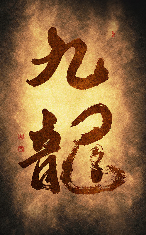
九龍 - 9 dragons - this phrase has a special meaning, and if you want to learn more, please visit Ink Treasures page, which I co-created with an ink painter, Mariusz Szmerdt. 九天 - heavens or skies; this word already appeared in ancient China. It literally means *nine skies*, where 9 stands for nine directions of the world. Centre was known as "great sky" (鈞天), the east as "dark blue sky" (蒼天), west as "clear sky", south as "fire sky" (炎天), south as "mysterious (black) sky" (変天), north-west as "hidden sky" (幽天), south-west as "crimson sky" (朱天), and south-east as "sunny (yang) sky" (陽天). These directions were closely related to the ancient believes, but also the political map of China. Another theory explains that the 九天 stands for 9 elements that the earth revolves around, those were sun and moon, 5 elements (water, metal, earth, wood, fire), the "fixed" star (possibly the North Star).
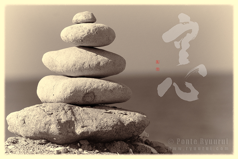
Early morning, I went to the beach today to shoot some aroma oils photos for a new project that I am working on with a Japanese artist, Snow Forest. Beach has one of the most simple landscapes, yet there is always so much to photograph. Shells, driftwood, sand patterns, waves, stones, and so on. So, I gathered a few pebles, and made a simple Zen sculpture. Then I added my calligraphy work to it in photoshop. 空心 - the void mind, or void heart, a heart which is filled with nothing but peace, harmony and nothingness of thoughts. Calligraphy in semi-cursive script.
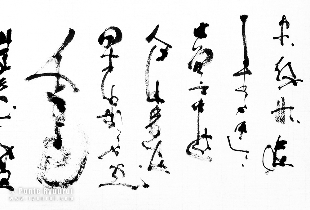
Non-character calligraphy is practiced mostly in China and Japan, though it is a very rare style of Chinese calligraphy. It is of rather modern origin, and it slightly overlaps with the avant-garde calligraphy style. Its basic concept is to prove that the beauty of calligraphy does not have to be tied to the balance and shape of the Chinese characters, but it lives as raw energy in the dynamics of calligraphy brush strokes. Extended studies of Chinese classics, and countless hours spent on writing, allow a calligrapher to utilise his knowledge in such a type of art which is completely disconnected from the language itself, and it proves without a shadow of doubt, that Chinese calligraphy is written with a soul, not the hand.
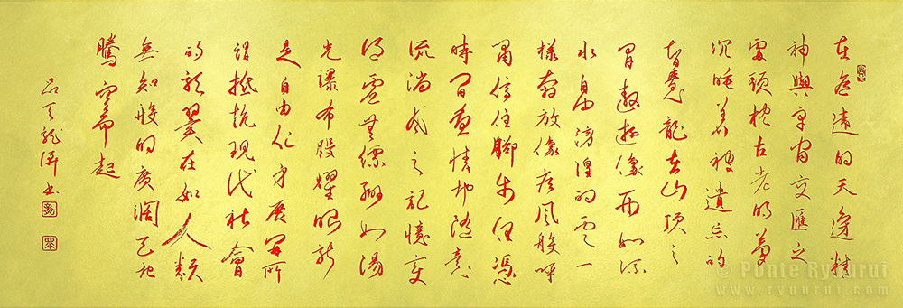
Pictured calligraphy (fragment) has no semantic content. It is a record of a state of mind. I wrote this poem last year. I really like it, so I asked my friend to help me with the Chinese translation. I was planning to write a Chinese calligraphy using this text, but I did not have enough time to do so, till now. For me, writing calligraphy is always a journey through time and space. I dive into the classics and masterpieces, and search for proper Chinese character forms, to push my calligraphy skills even further. This text took me approximnately 20 hours of research and studies, including writing several drafts with a ballpen. This is the first copy with the ink and brush, but I am sure it is not the last one.
Buy this artwork in printed form at my store on Fine Art America. Many thanks to my dear friends, Snow Forest and Terry Chan, for their help with translating and editing of the Chinese text.
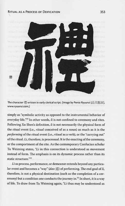
"By our rites of worship; latter-day sait views on ritual in scripture, history and practice", is a title of a book edited by Daniel L. Belnap, published by the Religious Studies Center. The reason I am writing a short article about is is because my humble calligraphy work is one of the few illustrations in this book. Last year I had trhe pleasure to be contacted by Ph.D. Michael Ing, who is currently an Assistant Professor at the Department of Religious Studies, Indiana University. He specializes mainly in Confucianism and Chinese thought. He asked me if I could write a calligraphy work for his book. I was quite thrilled.
Below photo shows calligraphy of the character 禮 in early clerical script, known in Japanese as korei (古隷, lit. ancient clerical). There is one more publication of his in which you can see my calligraphy art on the book cover, titled *The Dysfunction of Ritual in Early Confucianism*, published by Oxford University Press. 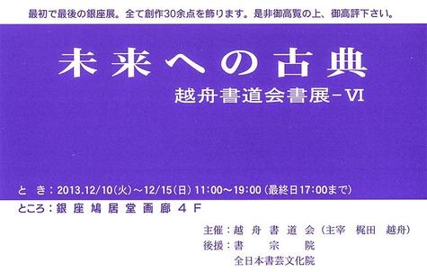 未来への古典 is a calligraphy exhibition celebrating 50 years of passing the knowledge of Japanese and Chinese calligraphy to his disciples, by Master Kajita Esshu (梶田越舟先生), who happens to be my calligraphy teacher for past 12 years. My teacher is not a person who enjoys exposure, publicity and all those things that people crave in modern times. He simply loves to teach, and loves calligraphy art. Having said that, this exhibition is a rare occasion to see his works, or meet him in person, and also to see the works of his selected students, during the Ginza exhibition in Tokyo. I will write another article with a more detailed update on possible lectures or calligraphy art demonstration during this exhibition. My humble work will also be displayed there. Hope to see you all in Ginza! 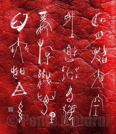 Today I was writing a calligraphy for an upcoming exhibition in Ginza, Tokyo. It is a quite important event, and it is so for two reasons. One is that Ginza is probably the most prestigious place that pone can display his or her art, and two, the exhibition is to celebrate 50 years of teaching career of my calligraphy teacher, Master Kajita Esshuu (梶田越舟, 1938 - present). Since he dislikes exhibitions and public spectacles, it makes this event even more special. So I wrote a few copies in "hard core" oracle bone script (甲骨文), and suddenly I decided to go bananas. I made my own semi-cursive version of 3500 years old script. And why not? It is quite interesting to mix and match the ancient script with another that evolved nearly 1500 years later. A wise Chinese ink painter, Shi Tao (石涛 1642-1710), once said "ink and brush should follow the times". I think they just did. Master the basics, master the scripts, and let your brush take over. Calligraphy is based on strict rules, that is true, but it is an art. All the greatest handwriting styles were created by those who dared to venture into the unknown. Poem (of my authorship, inspired by a poem by Li Bai): Bright moon illuminated the night skies Concealed in haze of vast sea of clouds Wind that travelled a few thousand miles Fluttered my mind light as silk 明月照夜空 藏蒼茫雲海 風游幾萬里 心舞如白糸 |
Categories
All
AuthorPonte Ryuurui (品天龍涙) Archives
August 2020
|





 RSS Feed
